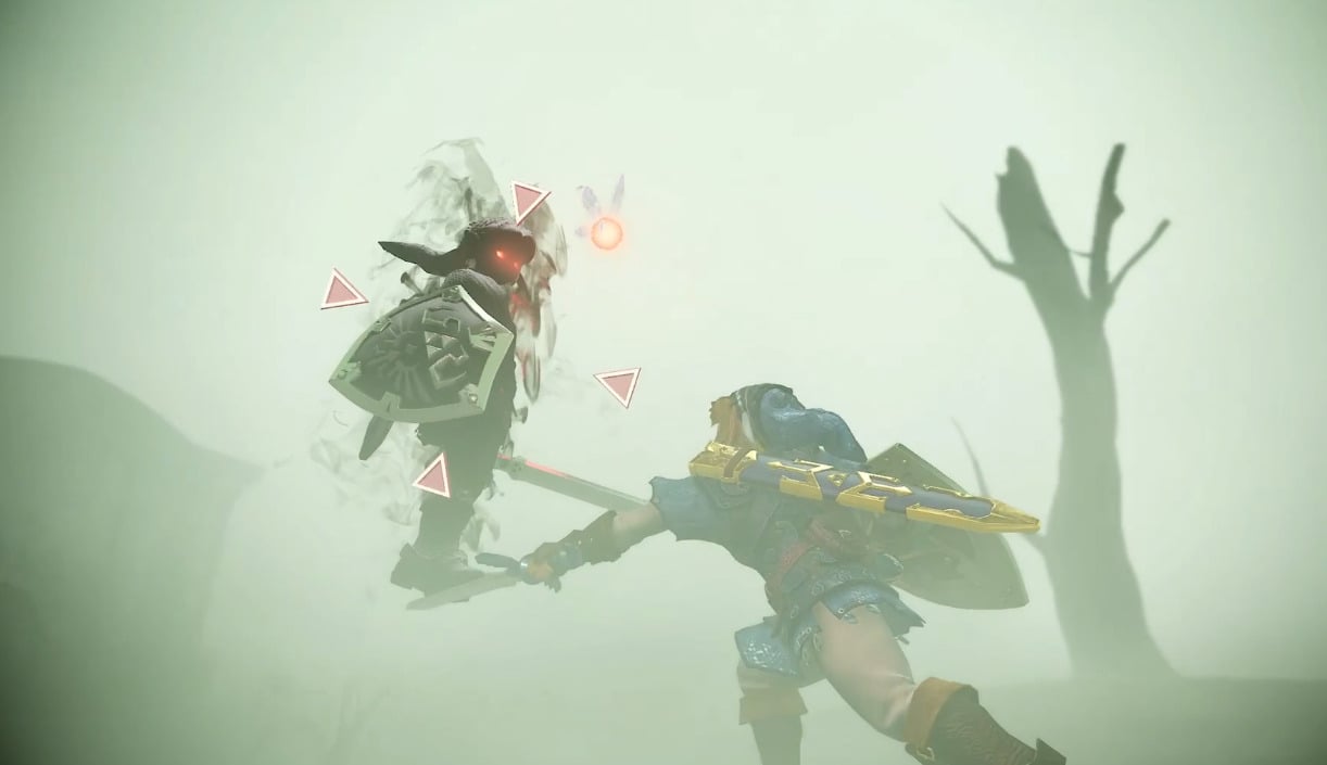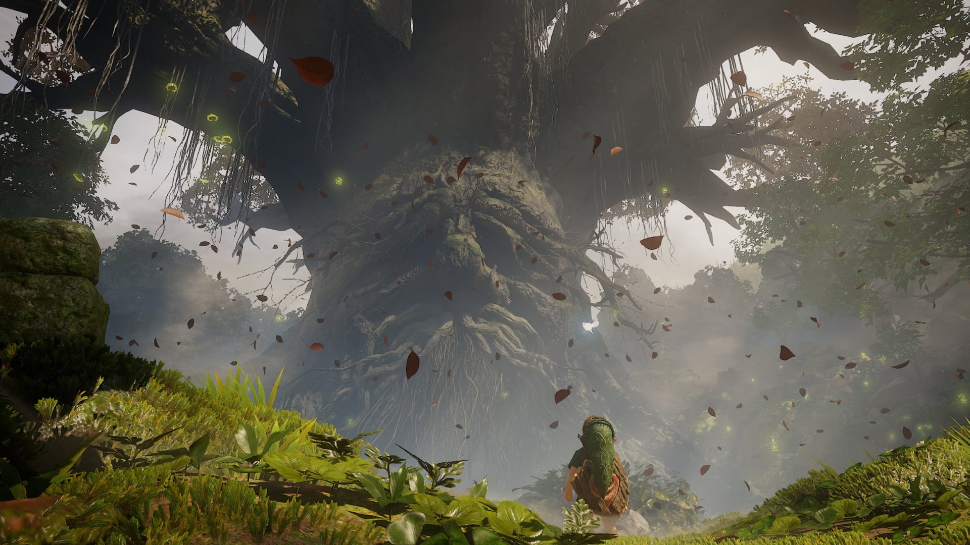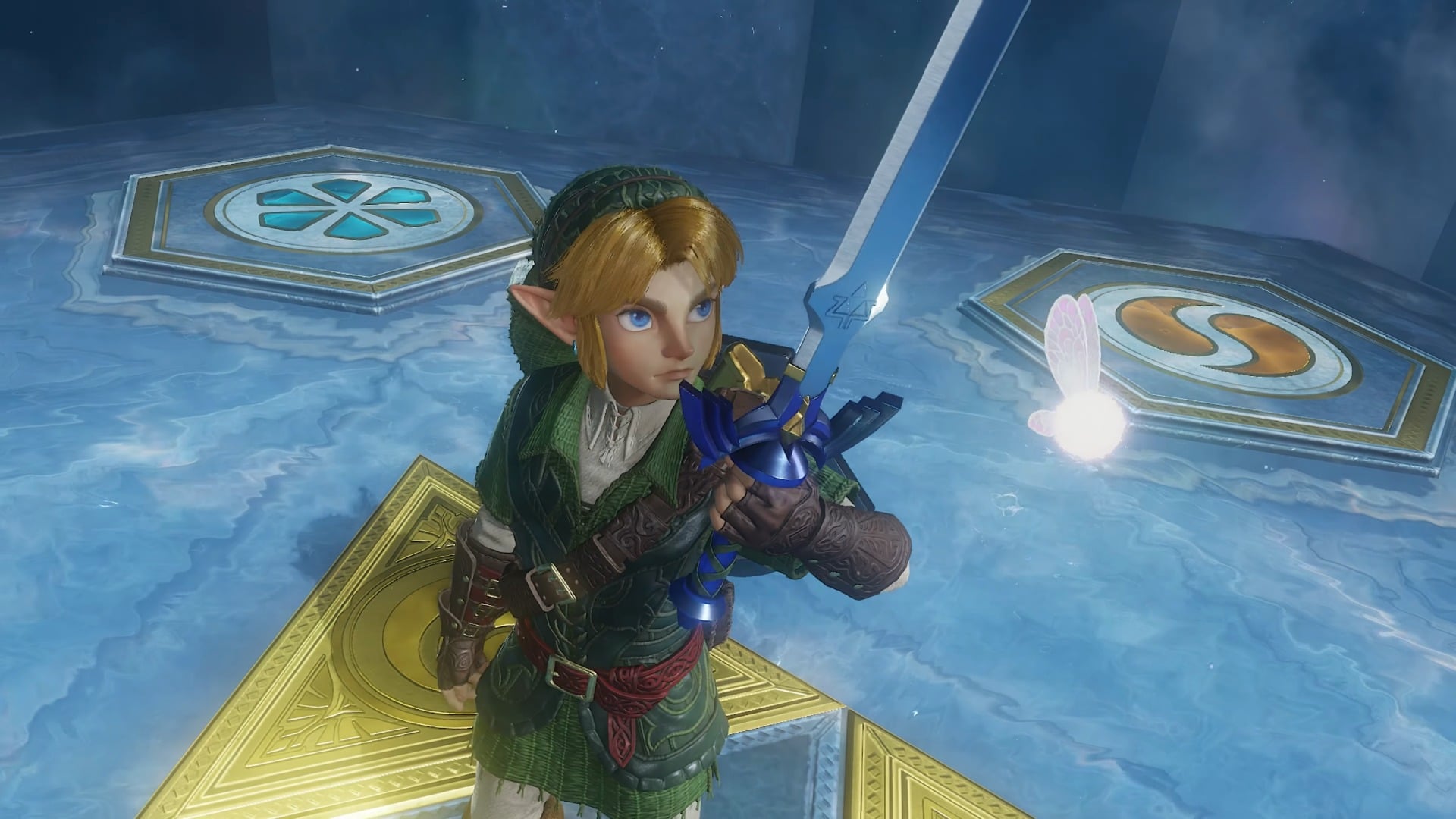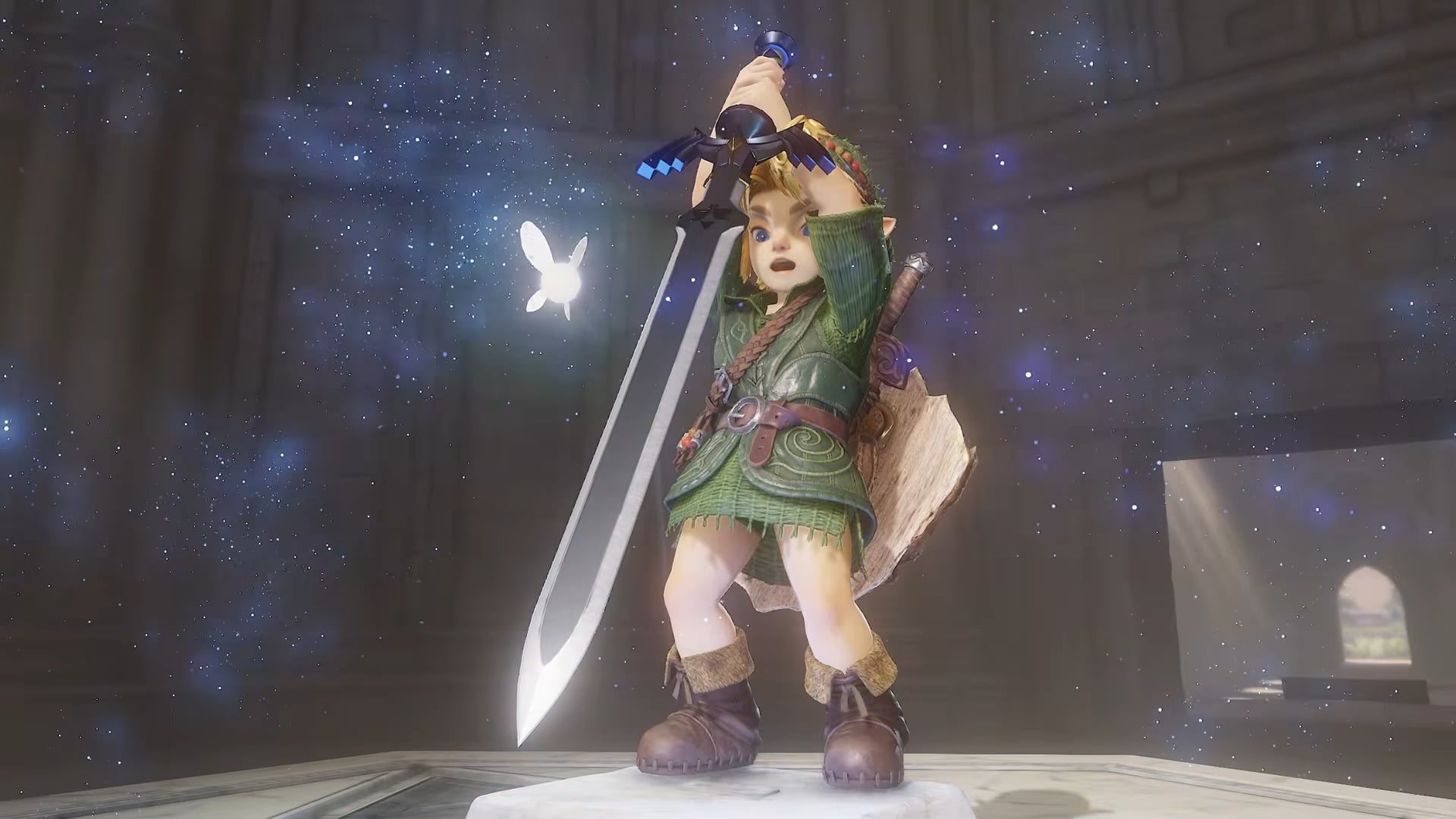
When Nintendo first revealed the Ocarina of Time remake, I was disgusted. Link’s hyper-realistic look chucked his ass from the happy greenery of Kakariko Forest and planted him firmly in the Uncanny Valley. But since it was only a brief glimpse, I thought I was being overly judgmental, and maybe a more in-depth look would change my mind. Well, I got that better look today during Nintendo’s Legend of Zelda 40th Anniversary Direct presentation, and my mind has not been changed. Link looks like a freak.
He’s possessed of a slick, plasticky look that’s exacerbated whenever he gets wet. I thought it was giving Unreal Engine 5, but it’s actually worse: If I didn’t already know this Link was made by Nintendo’s anti–AI hands, I would have thought he was somebody’s genAI slop project.
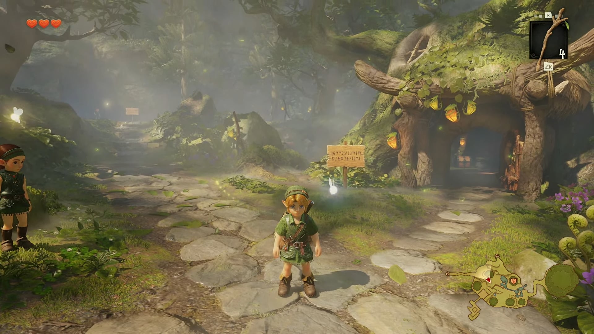
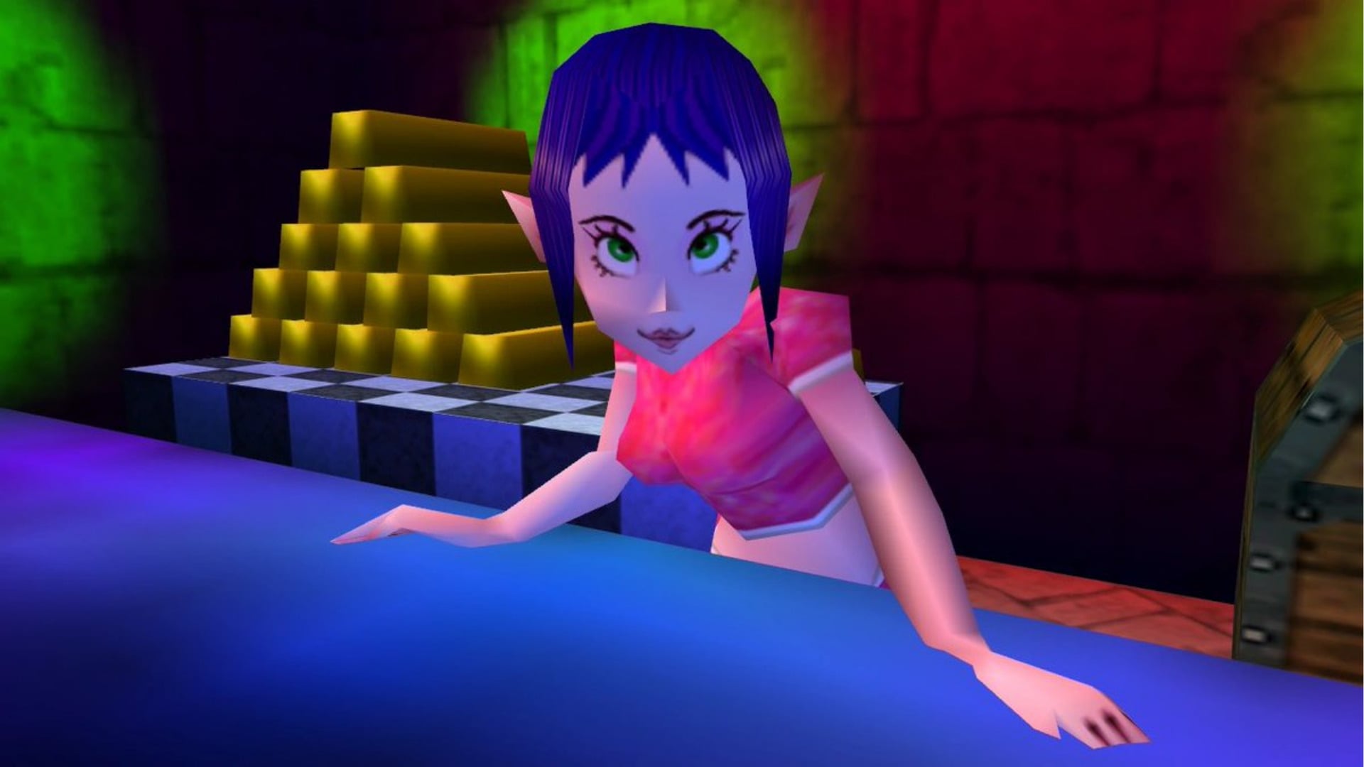
But the odd thing is, it’s only Link that disturbs me so badly. The monsters look great, exactly how I’d imagine the enemies in an “updated” Ocarina of Time to look. Link’s non-human friends like Princess Ruto—fabulous. The Great Fairy? Even more fabulous.
Throughout the extended look, everyone around him features far less detail in their designs, which makes them look 100-percent better. It’s like Link’s been isekai’d into a slightly different world where everyone’s a bit more cartoonish-looking than he is. Even his adult form is far less offensive.
However, this isn’t the first time the internet has gotten up in arms over the look of the new Zelda game. We did it with Wind Waker and it’s super-cartoony cel-shaded look, and again when Twilight Princess looked like Nintendo had dumped it in a bucket of soot. It’s Ocarina‘s time to ignite the great Zelda graphics debate, and whatever game comes after it likely will too.
There’s an idea in the gaming development community that the great chase for realism ultimately makes a game look dated. Even though the original Ocarina of Time‘s look was constrained by the hardware limitations of the Nintendo 64, all the sharp angles and polygonal jankiness that we might think of as “quaint” today still contributed to an iconic look inseparable from the game itself. Nintendo, by virture of being Nintendo, has always prioritized its creative vision over appealing to popular trends. The look of this Ocarina remake feels like the first time Nintendo’s aiming for the kind of hyper-realism specific to games being made right now—something to compete aesthetically with the Wolverines and GTA VIs of the world—rather than going in a direction different from everyone else.