If there’s one thing that’s helped The Legend of Zelda: The Wind Waker stand the test of time, it’s the game’s distinctive art style. But it turns out this now-defining aspect stoked some controversy in development. According to a slew of old interviews, resurfaced and translated by the folks at DidYouKnowGaming?, Nintendo bigwig Shigeru Miyamoto initially couldn’t stand the way the game looked.
It is almost impossible to picture a Wind Waker that doesn’t look like Wind Waker. First released stateside in 2003 for the GameCube, it deviated visually from the previous Zelda games, Ocarina of Time and Majora’s Mask, both released for N64. Rather than an ill-advised attempt at photorealism—which, in the era of gaming’s technical arms race, would’ve doomed it to a brief half-life—Nintendo stylized Wind Waker with cel-shaded graphics, giving the game a fairy tale effect. Wind Waker was re-released 10 years later with a handful of quality-of-life improvements, and while some of us disagree over which version looks better, the general consensus was: Wow, this game holds up
At first, according to DidYouKnowGaming?’s translations, the plan was indeed to do a Zelda with an improved iteration on the art style of the N64 games. But early in development, an artist stylized a “toon Link.” The rest of the team loved it, and went all in, designing the rest of the game around this reimagined version of the longtime character.
Longtime Legend of Zelda producer Eiji Aonuma assumed Miyamoto wouldn’t be fond of the cel-shaded style, and held off showing the game until Wind Waker was far along in development. Reportedly, Miyamoto “literally cringed,” saying that he didn’t think it’d sell and that it wasn’t too late to shift the art direction. But the development team pushed back, citing enthusiasm for the art style. Also, they argued, they simply didn’t have the staff to create a realistic-looking Zelda in any less than a decade.
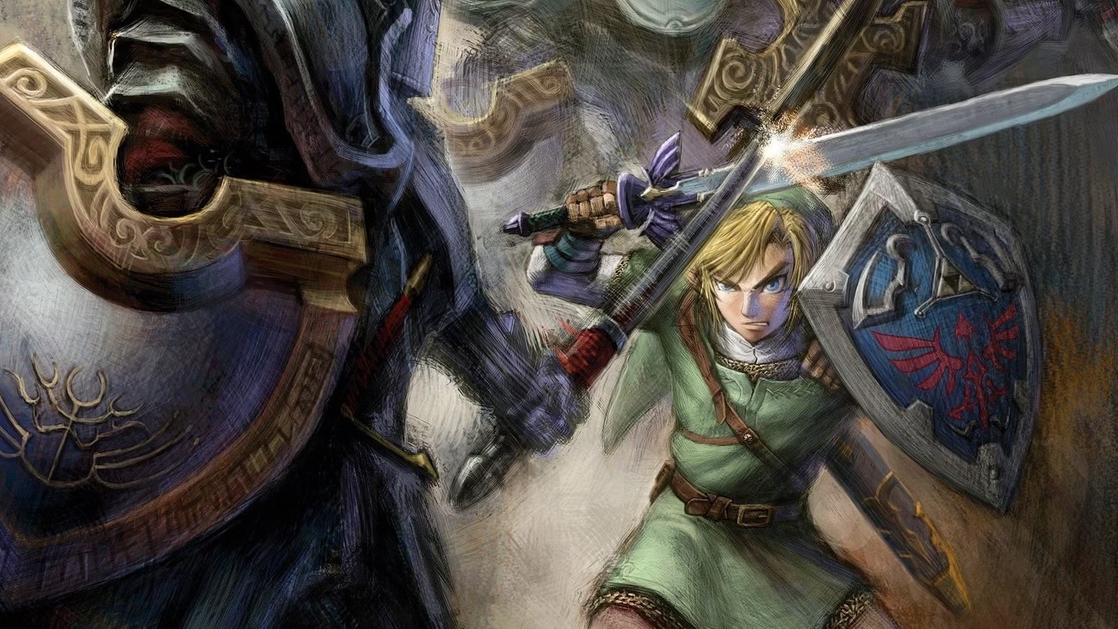
“If I had gone to him from the very beginning, I think he would’ve said, ‘How is that Zelda?’” Aonuma said. “Miyamoto had trouble letting go of the realistic Link art style until the very end.”
Miyamoto wasn’t alone. Back in 2001, following Nintendo’s reveal of Wind Waker, a subset of fans blasted the visuals for being too cartoonish. They wanted the previous visual style: seen not just in Ocarina of Time and Majora’s Mask, but in a Zelda tech demo for GameCube showcased the prior year. They called Wind Waker “Cel-da.” They said it looked uncool. They longed for a Zelda that looked like Final Fantasy X. They are, one assumes, now eating their words.
DidYouKnowGaming?’s deep dive covers a whole range of topics beyond Wind Waker’s visuals, including the genesis of the core gimmick (using a conductor’s baton to manipulate the wind) and the much tougher difficulty the game had in development (which was reintroduced, albeit with tweaks, as the difficulty-ramping “hero mode” for Wind Waker’s WiiU release). If you’re at all interested in the game, the whole video is worth a watch

