Games are cheaper than ever, but the three cataract surgeries I paid for this year in order to read the words in them has made the hobby itself way more expensive.
In all seriousness, it’s 2019 and so many games, both big and small, are still impossible to read without squinting until a blood vessel pops. The problem of tiny game text reared its inscrutable head last year as well, and we’ve arrived at some solutions, such as zoom-in features and other optional settings.
Both The Outer Worlds and Death Stranding released with headache-inducingly small words, and were later patched to make them more legible. Fire Emblem: Three Houses is on Switch where players can zoom in at their leisure. But these are more like band-aids over the problem than ideal fixes, like shipping books with magnifying glasses rather than also publishing them in big print form. If something major doesn’t change soon, they’ll have to ship The Witcher 4 with a telescope.
Here are all of the games we could barely read this year, and please be sure to share the ones that eluded your eye as well.
Kingdom Hearts III
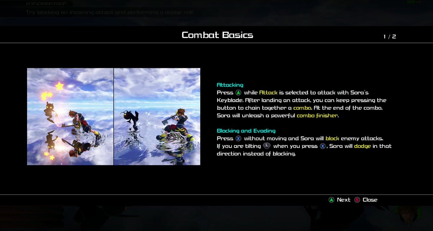 Kotaku editor Maddy Myers had harsh words for Kingdom Hearts III’s grotesque fonts. “The size wasn’t great, but mostly the font choice is bad,” she told me. “I HATED reading all of these instructions.” While you were busy commenting she would have been studying the keyblade, but Square Enix decided to attack her eyes instead.
Stellaris (Console Edition)
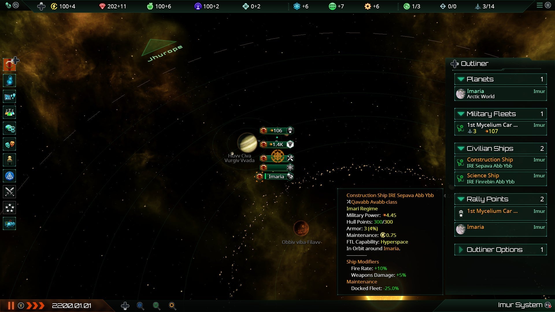 Stellaris is an excellent 4X strategy game that is decided superior on PC, but I decided to play it on Xbox One so I could sit on my couch, a choice Paradox Interactive decided to punish me for by forcing me to manage my space empire as if all my accounting documents had been put through the shredder.
The Division 2
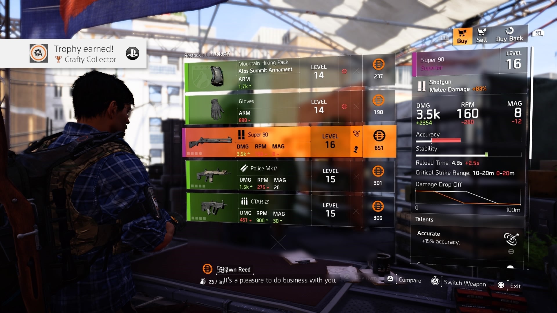 I can appreciate The Division 2‘s attempt at a sleek, minimal, techno-futurist-looking UI, but when I spend half the game trying to compare and contrast the numbers on my loot using my brain made of meat matter, it begins to take its toll.
Days Gone
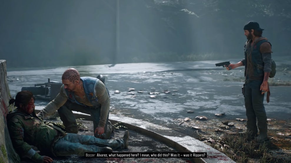 Deciphering Days Gone-speak can be challenging enough on its own, but cramming blocking subtitles into the very bottom of the screen doesn’t make it any easier.
Dragon Quest Builders 2
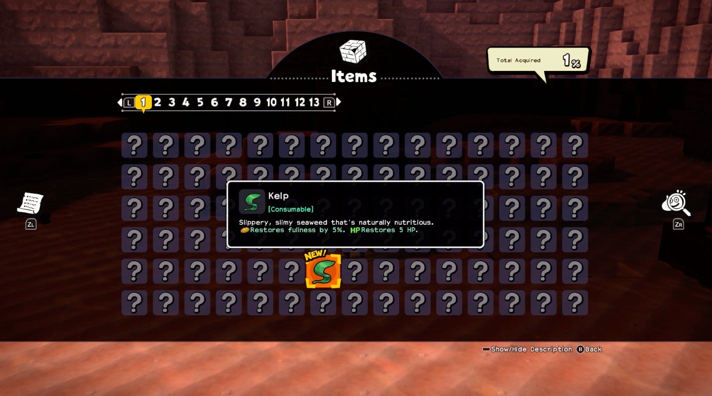 Kotaku Editor-In-Chief Stephen Totilo was delighted to acquire some Kelp but had no idea what it did until he manually enlarged the item’s description using the Switch’s zoom feature
Total War: Three Kingdoms
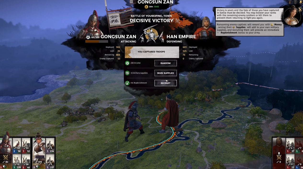
Total War: Three Kingdoms strikes such a perfect balance between the approachable and the strategically arcane in almost every way except when it comes to the text size. Please tell me more about the stats of the battle I just micro-managed and spend less screen space on tiny model trees.
Fire Emblem: Three Houses
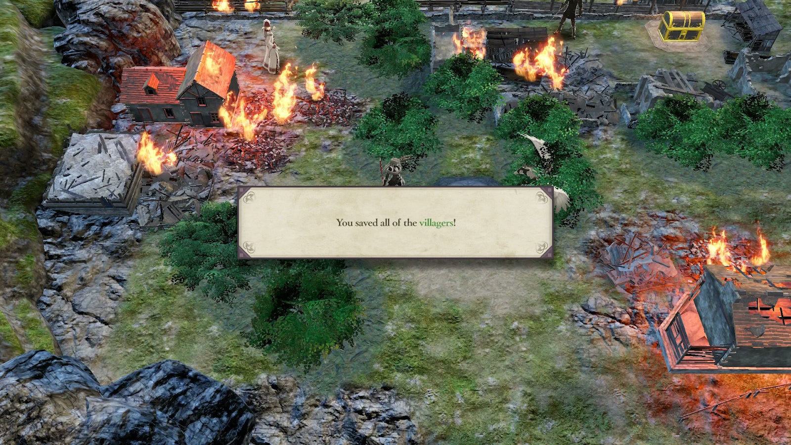 Staff writer Gita Jackson called out Fire Emblem: Three Houses’ incredibly tiny text size earlier this year. Apparently the best dialogue boxes aren’t the ones with one third white space on either side.
Remnant: From the Ashes
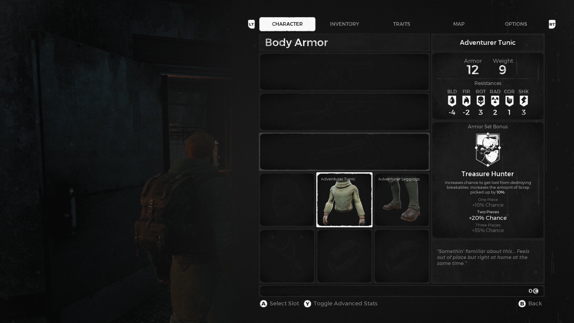 I briefly dipped into Remnant: From the Ashes during the holiday break because I’d heard a lot of good things about it and it was also on Game Pass. I also ventured a wild guess that its menus would be a little bit hard to navigate, and sure enough, the stat rolls on my demon hunter’s base armor are all but incomprehensible when I’m not standing four feet from my TV.
Control
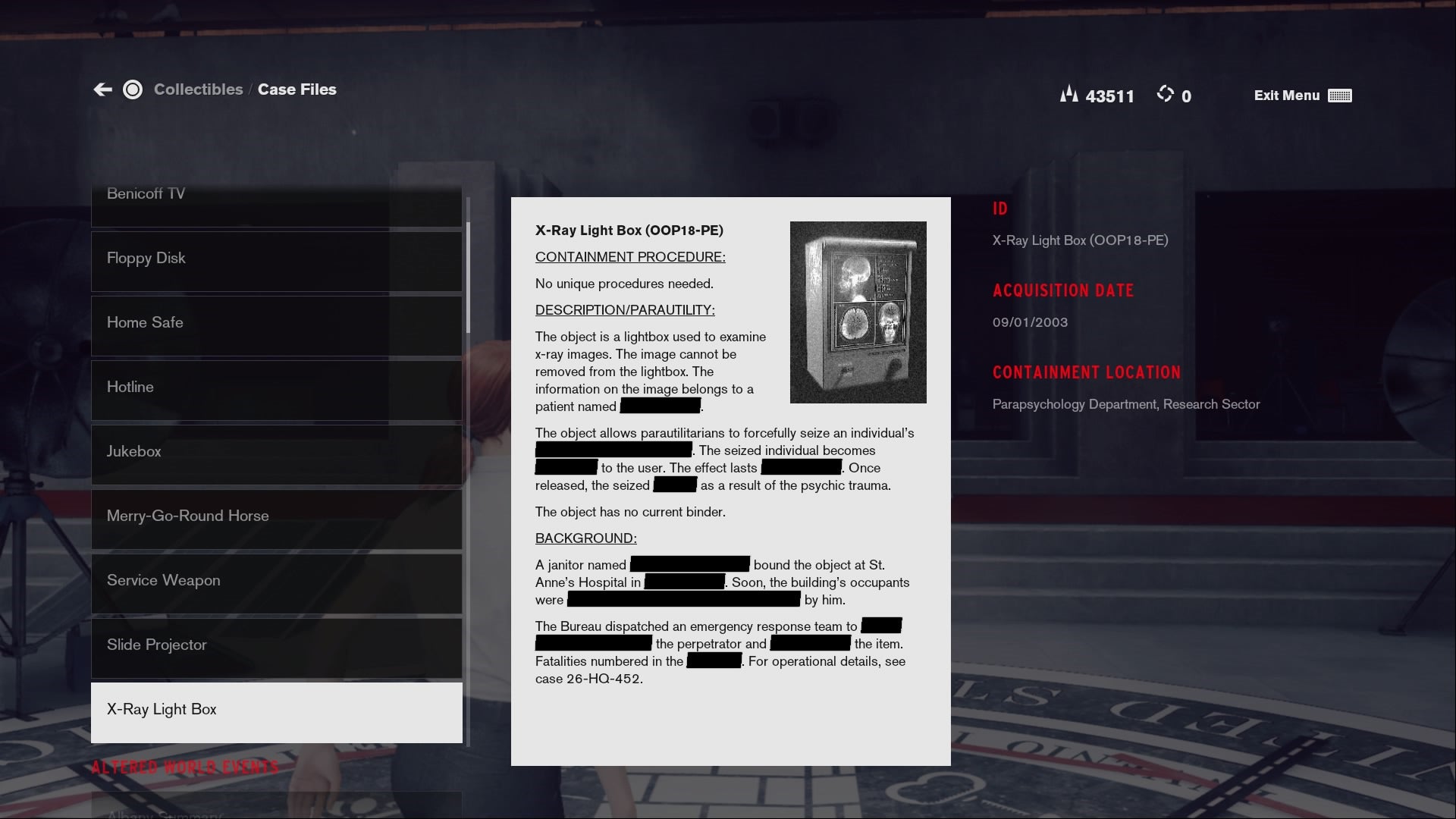 Control has some of the best lore collectibles of any game this year. Unfortunately they are also as hellish to try and decipher as some of the game’s late-game shootouts. While Control lets you pump up the subtitle size, its menus and research files are one-size-only, and that size: way too fucking tiny.
The Witcher 3 (Switch port)
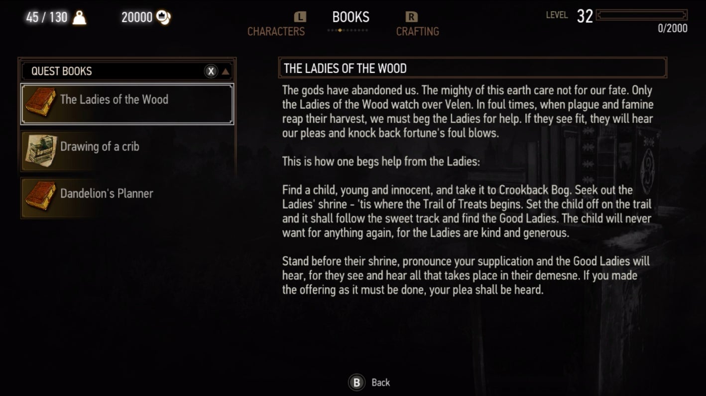 The Witcher 3 had terrible text size when it released in 2015 and the problem returns in this year’s otherwise impressive Switch port. Totilo also needed the Switch’s zoom feature to read the dozens of books Geralt can pick up along his journey, but it’s also a problem for comparing weapon stats and navigating the game’s skill tree. If only Geralt’s spectacles also worked for the player.
Greedfall
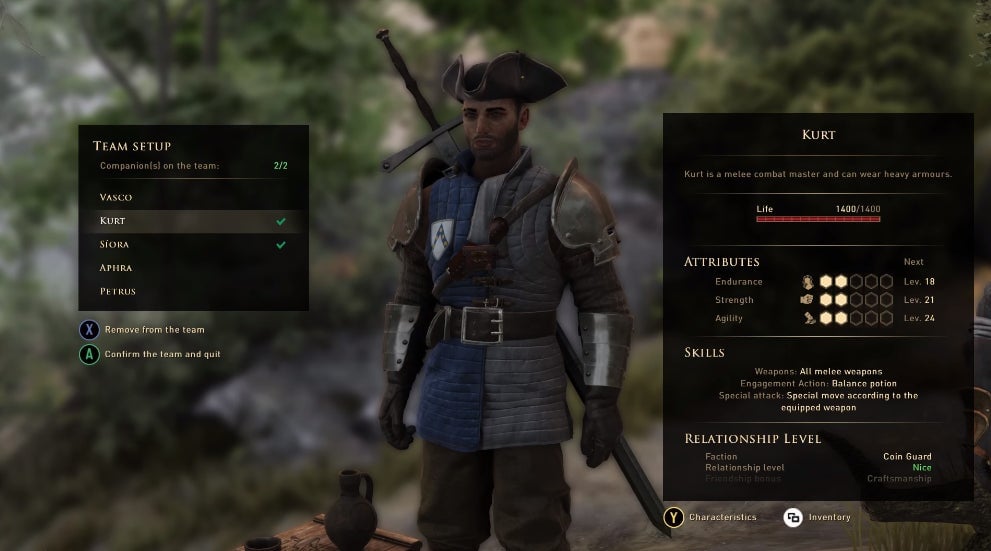 Staff writer Heather Alexandra described her mixed feelings about Greedfall in a lengthy Kotaku review, but one of its shortcomings is very clear: its menu text leaves something to be desired. Here we have Kurt who is probably a totally capable companion but we’ll never know because the small bolded text describing his unique skills smudges together into oblivion.
The Outer Worlds
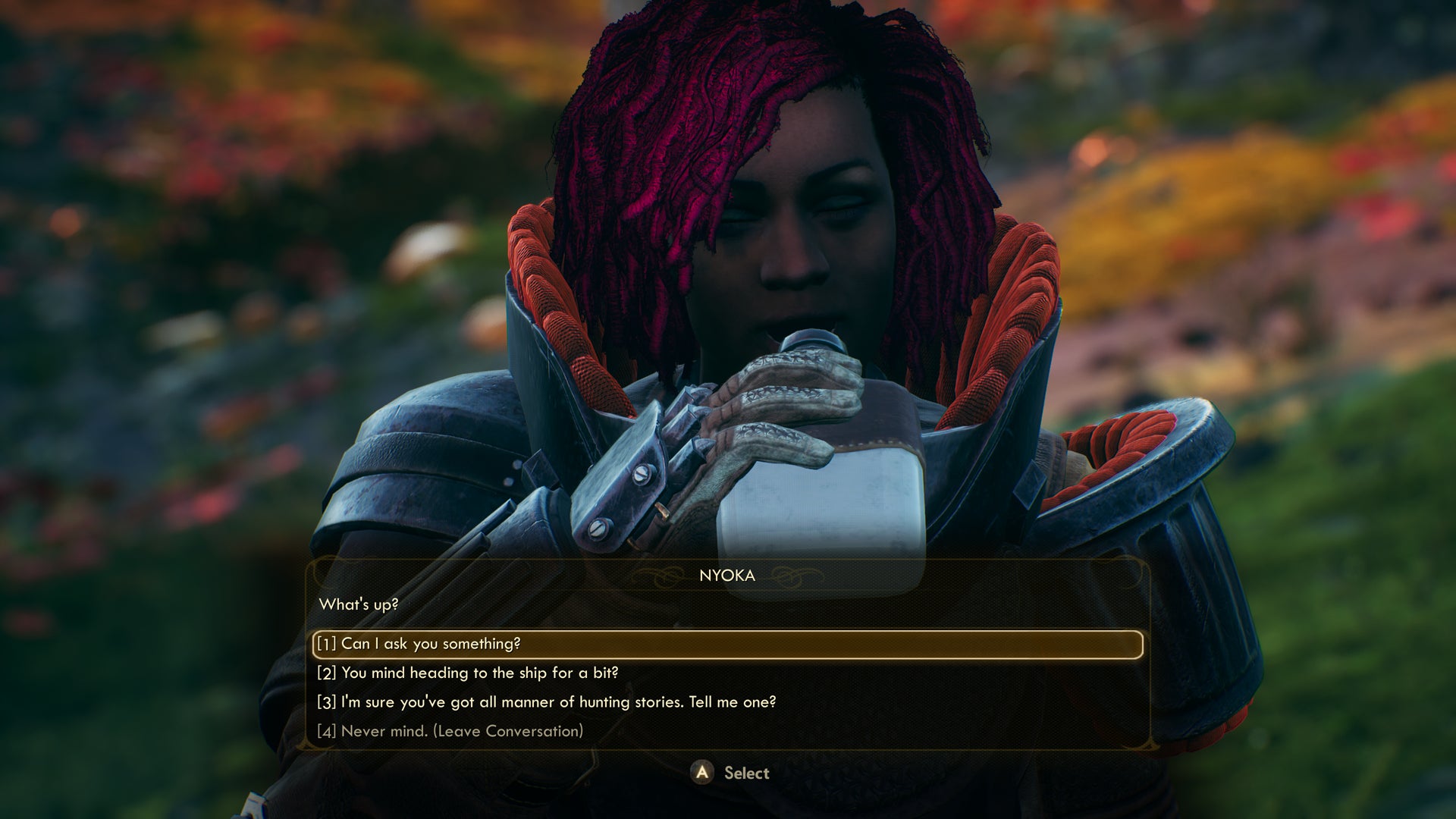 The Outer Worlds is an inter-planetary role-playing game about reading people’s email and then deciding whether to fuck them over or not. More than once I decided to skim a computer terminal and then blindly fumbled my way through a companion’s dialogue tree because I only have two eyes, and unlike my friends in this game, they do not regenerate once all the bad guys in a 100 yard radius bite it.
Death Stranding
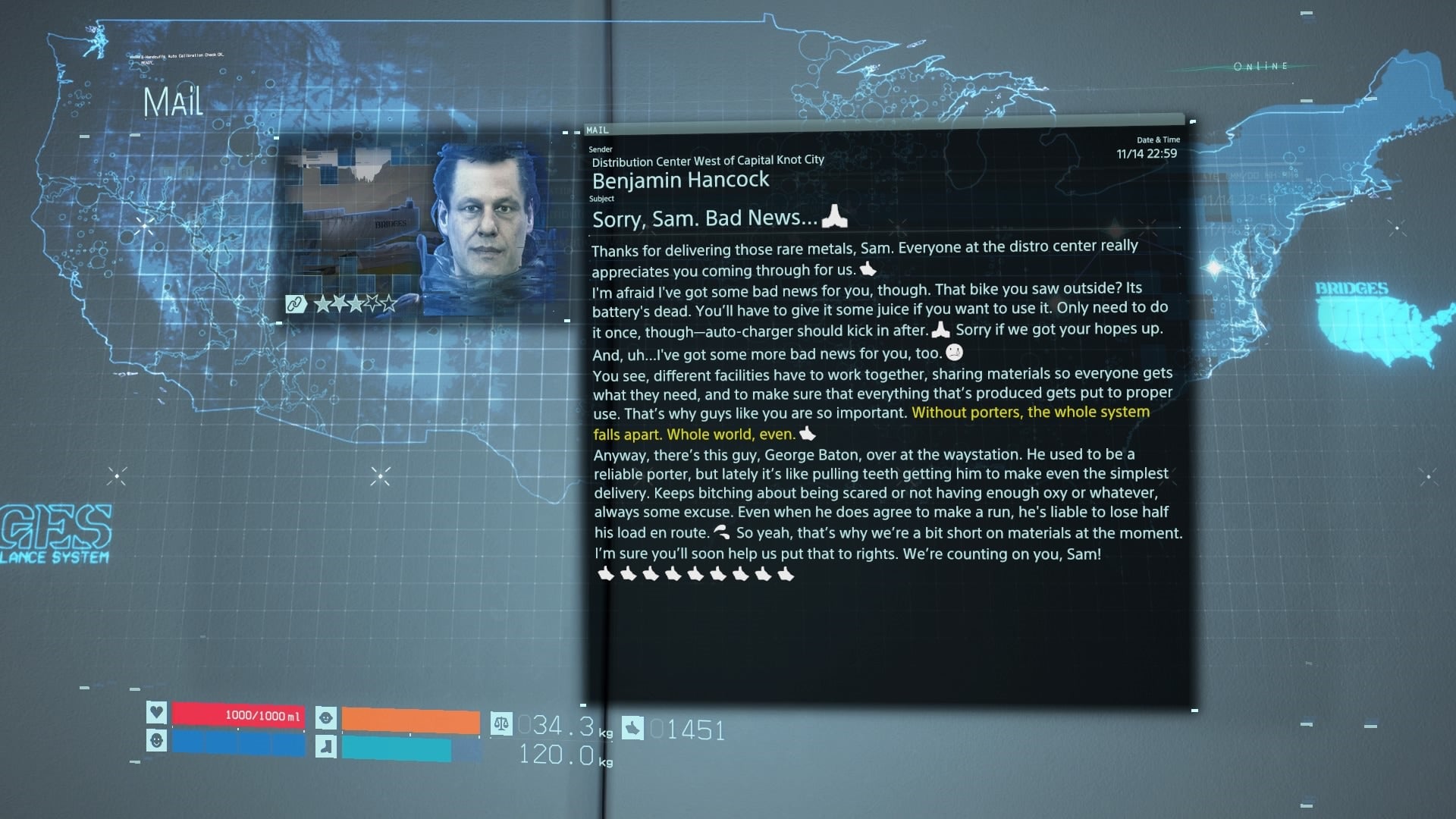 Sorry, Sam. Bad news. I have a bootlegged version of Microsoft Office that’s locked on 8pt font.
Ashen (Switch port)
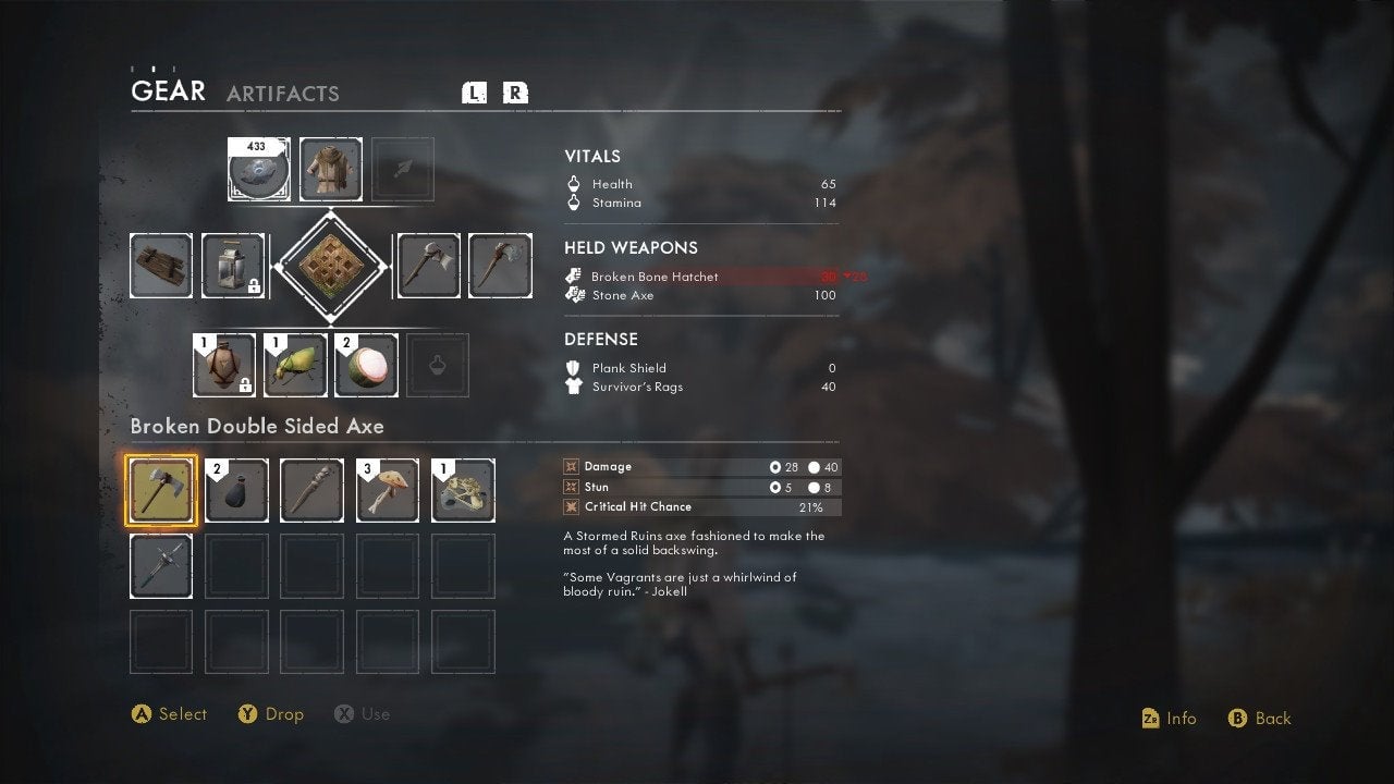 Ashen had hard-to-read text when it released last year on PC. It’s even worse on console, and while yes it is nice that the Switch lets you zoom in, we must draw the line here before that becomes the de facto excuse for all PC games that get ported without HUD size options.
“I play Switch in handheld mode and regularly was squinting at the text in its menus,” Totilo told me when he gave me this screenshot. “The game that wants me to care about lore that I could barely read.”
