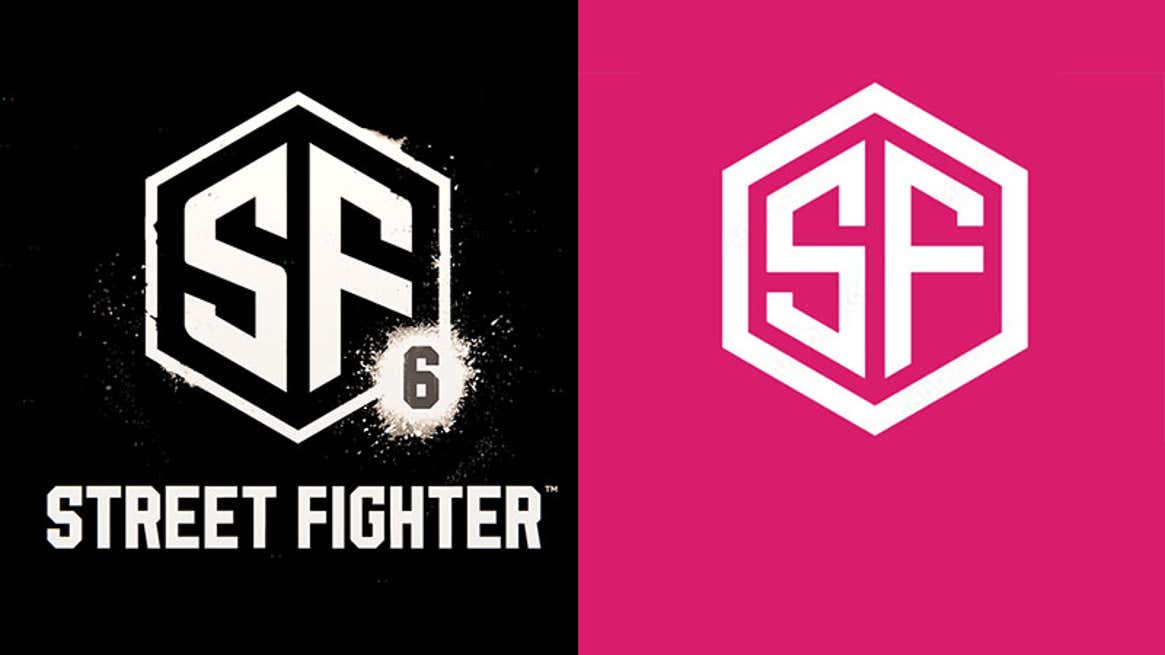
When Street Fighter 6 was first unveiled earlier this year, one of the weirdest and most noteworthy things about its otherwise unremarkable trailer was the game’s logo. Which, as I said at the time, looked a lot like a piece of clipart
If you missed it, on the left is the Street Fighter 6 logo as it was shown off in February, while on the right is a piece of clipart available commercially from Adobe for $80.
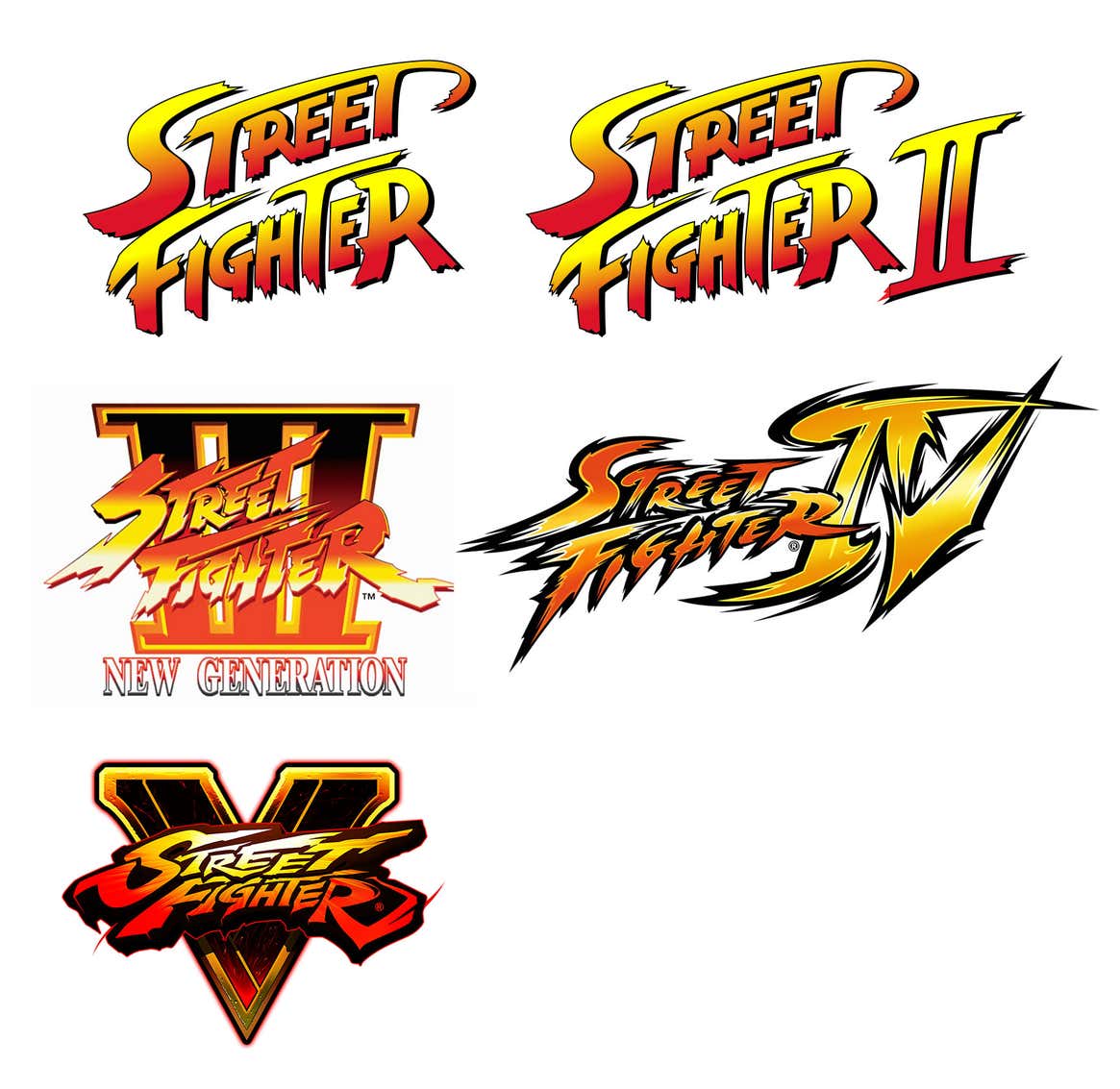
Considering the series’ long and proud history with badass logos, this was a huge disappointment! I mean, look at these babies!
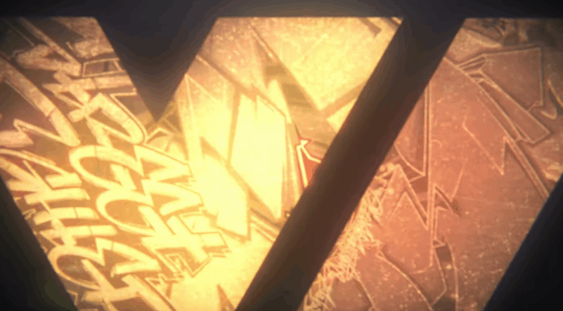
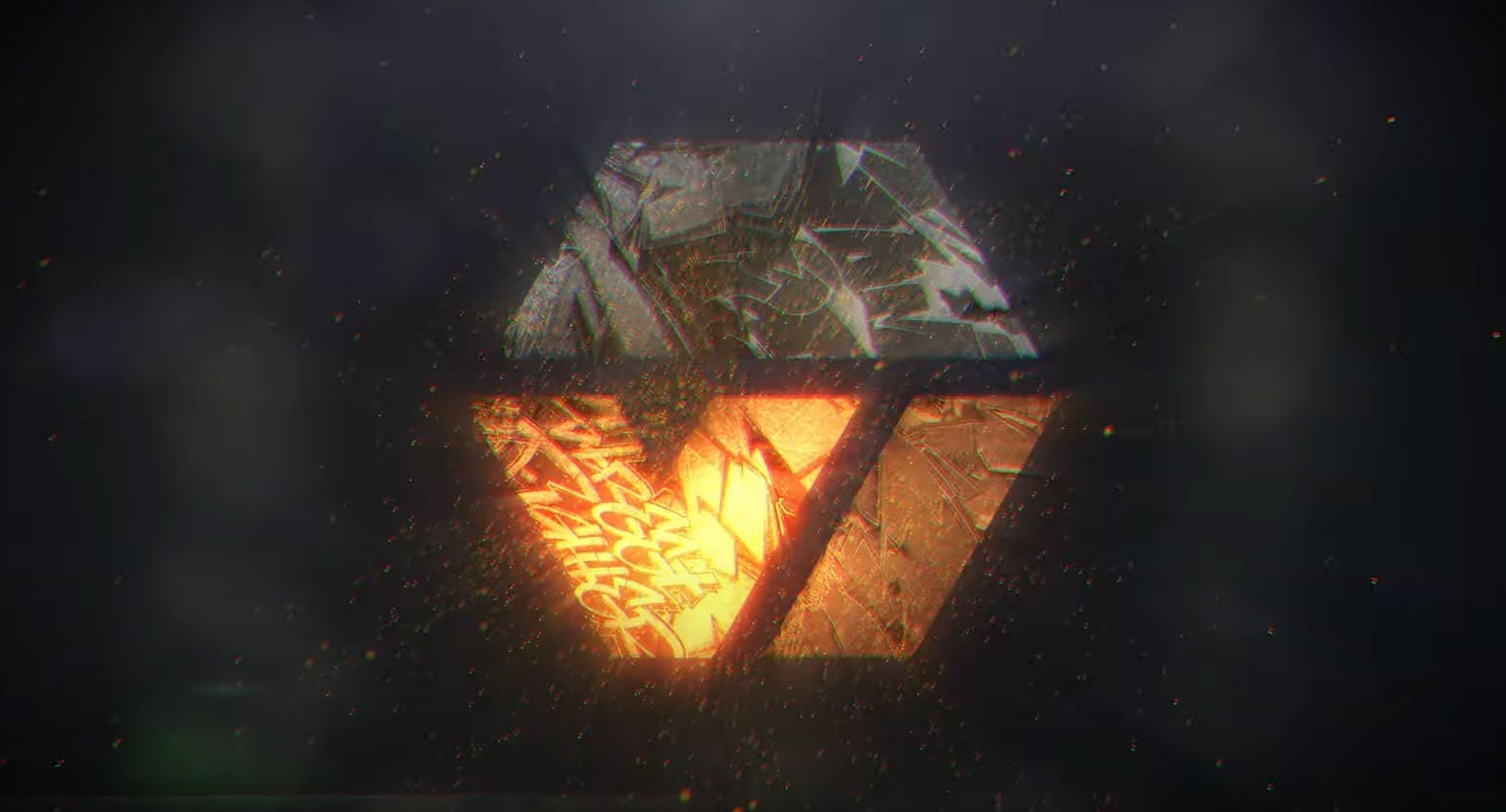
So it was interesting to see today that, when the game resurfaced with a new trailer, that cheap-ass logo had been removed and swapped out with something a bit slicker.
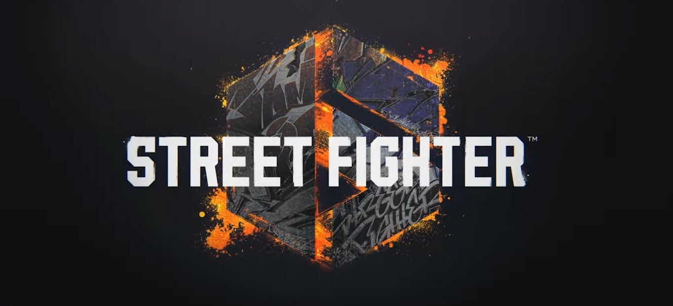
It’s actually not that different. It keeps the hexagonal shape of the first effort, along with its font, but switches things up slightly by turning that hexagon into a “6″. One that, in a neat trick, can be read two ways by flipping it on its side to reveal the Roman numerals “VI”, harking back to how every previous sequel in the series has used that convention (“Street Fighter II”, “Street Fighter IV”, etc):
Is it now a great logo? No. But it’s no longer a disaster. I think it’s interesting they went and changed it so soon, and I thought the flipped thing was neat enough to share! If you want to read more on the game’s big gameplay trailer from earlier today, head here and let Ian—who knows more about Street Fighter than the rest of us put together—walk you through all the changes, including the introduction of a very odd open-world section that looks a lot like NBA 2K’s neighbourhood, only without the sneaker stores.