We didn’t really get to see much of Street Fighter 6 when it was revealed yesterday, but one thing we did get a look at was the game’s logo. I did not think we could get to a point where fans are (rightly!) questioning a new game’s logo in the absence of anything more substantial to complain about, but here we are.
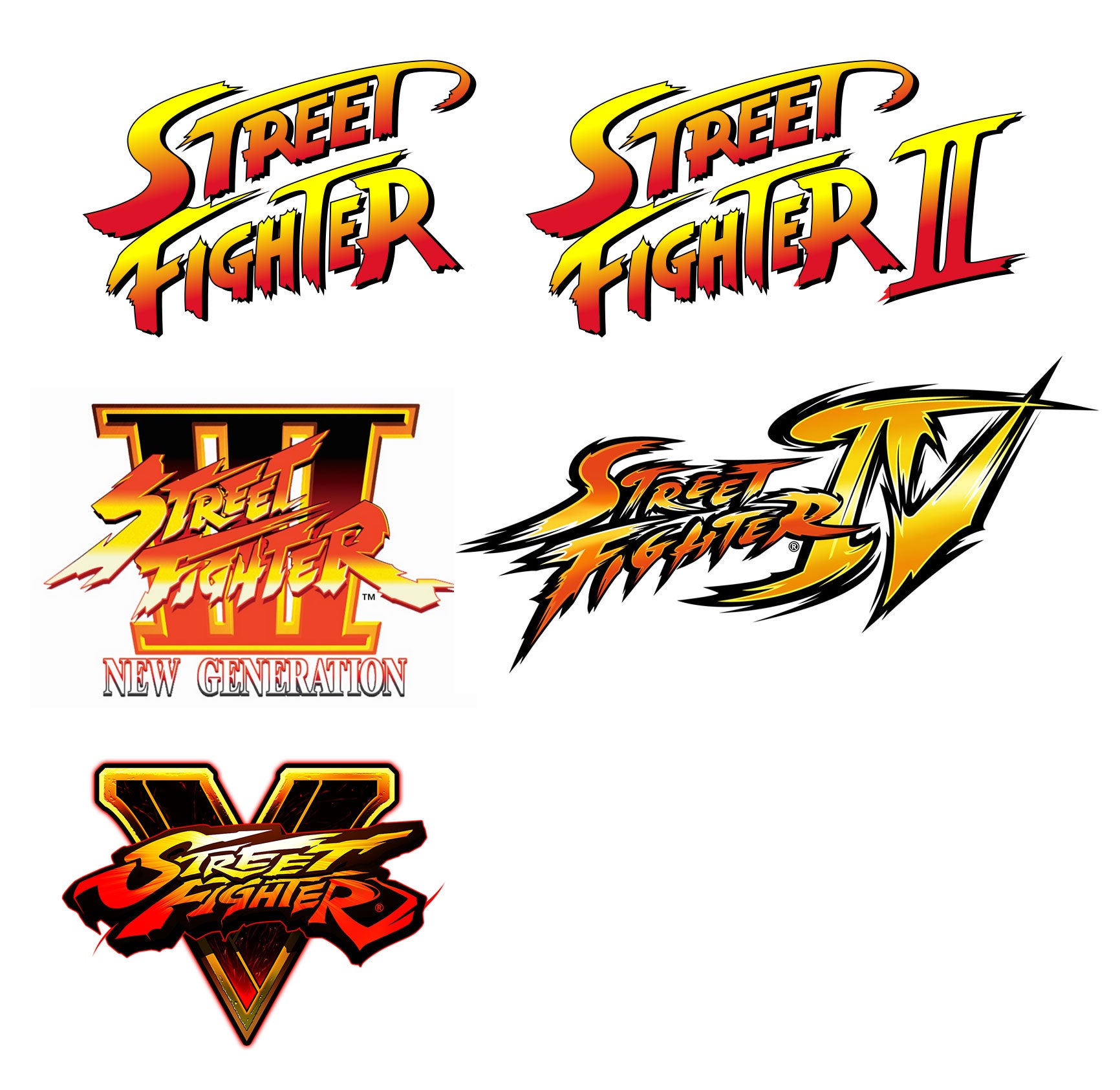
Street Fighter isn’t just one of the most popular video game series of all time, its logos have also been some of the all-time greats, perfectly representing the setting and style of the games. That splashy, martial artsy font has become as iconic as any of the series’ characters, and as you can see in the image below, from the first game’s release in 1987 through to 2016’s Street Fighter V, Capcom maintained a clear sense of continuity, linking each new game to the last:
Now let’s take a look at Street Fighter 6 and…oh.
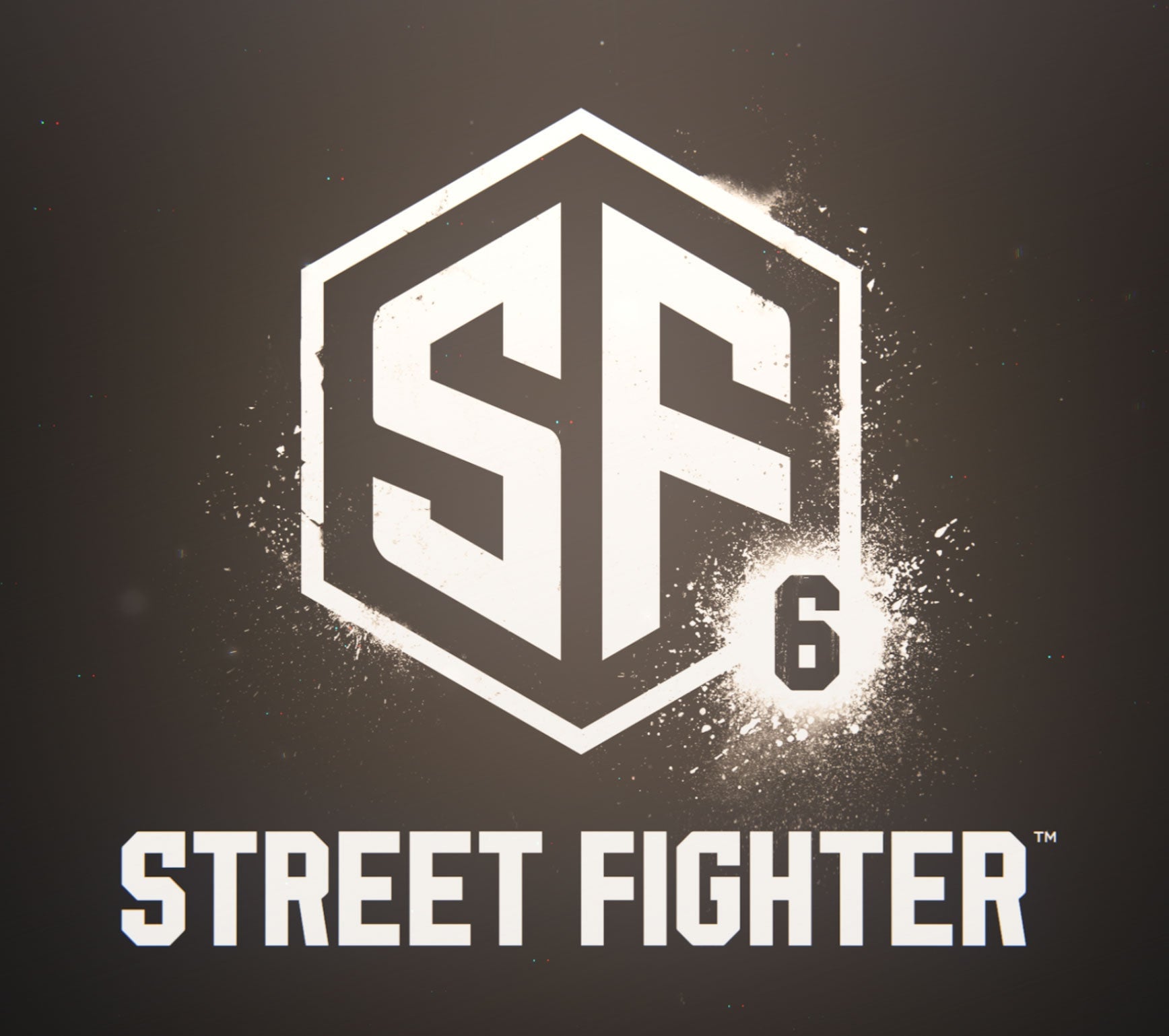
That beautiful, combative font is gone, replaced with something that looks like the logo of a studio that has been forced into a support role on Call of Duty games for the rest of its life. The Roman numerals are gone too, with a basic “6″ there instead. And the game’s logo itself is just…a big SF?
It looks bad. Bad like a coffee roaster that only advertises on Instagram. Bad like a company that makes cheap uniforms for social sports teams. Bad like, well:
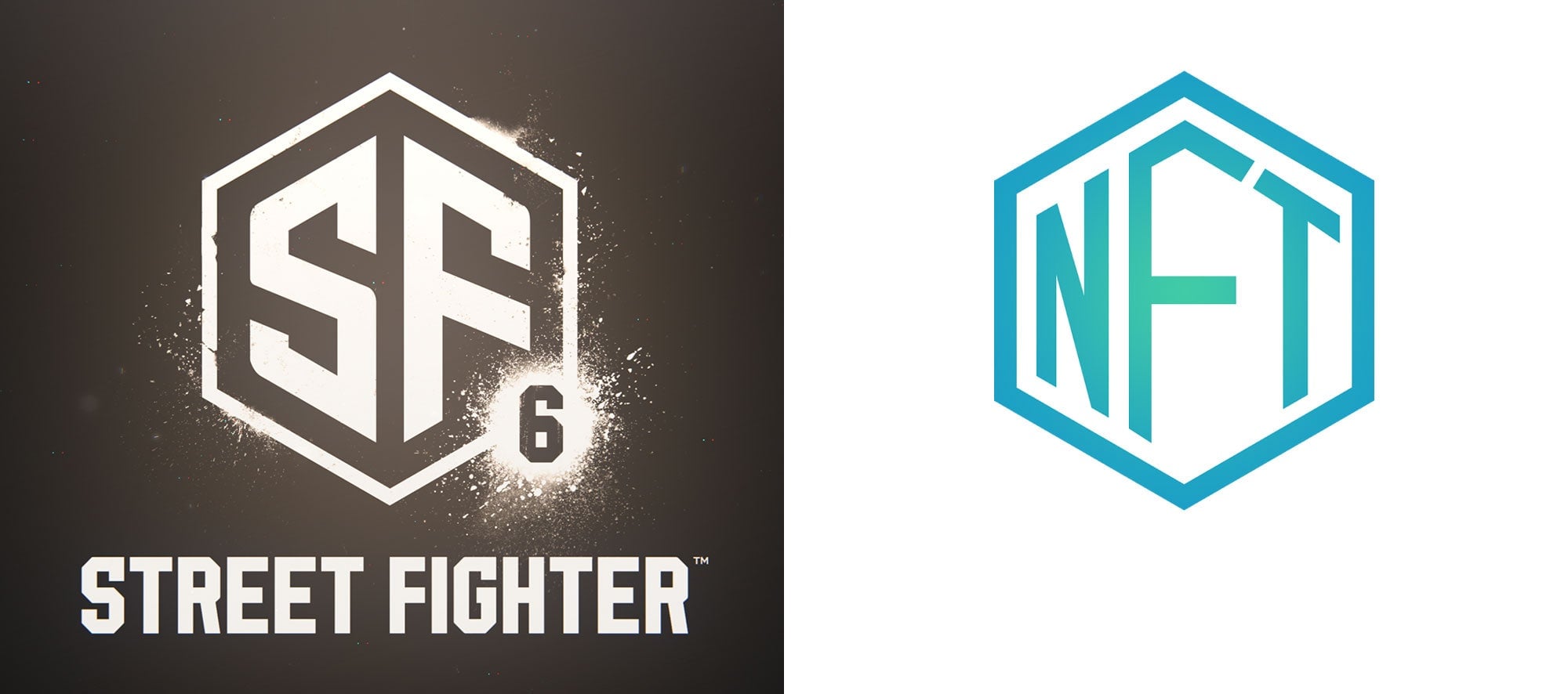
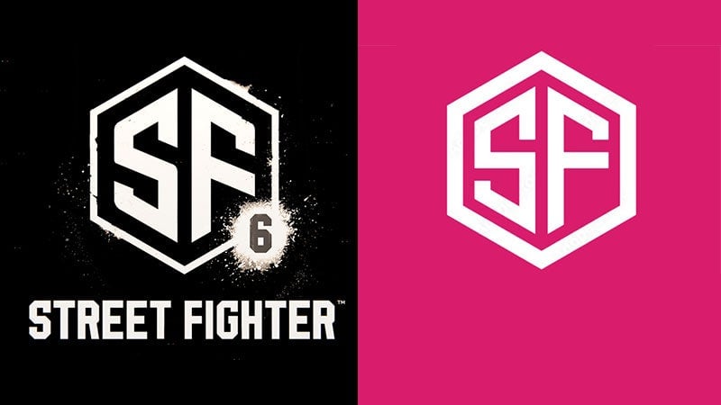
But wait, it gets worse. As Ars Technica’s Aurich Lawson points out, not only does the big “SF” part of the logo look like clipart, it looks a lot like a very specific piece of clipart, available for $80 on Adobe’s stock site:
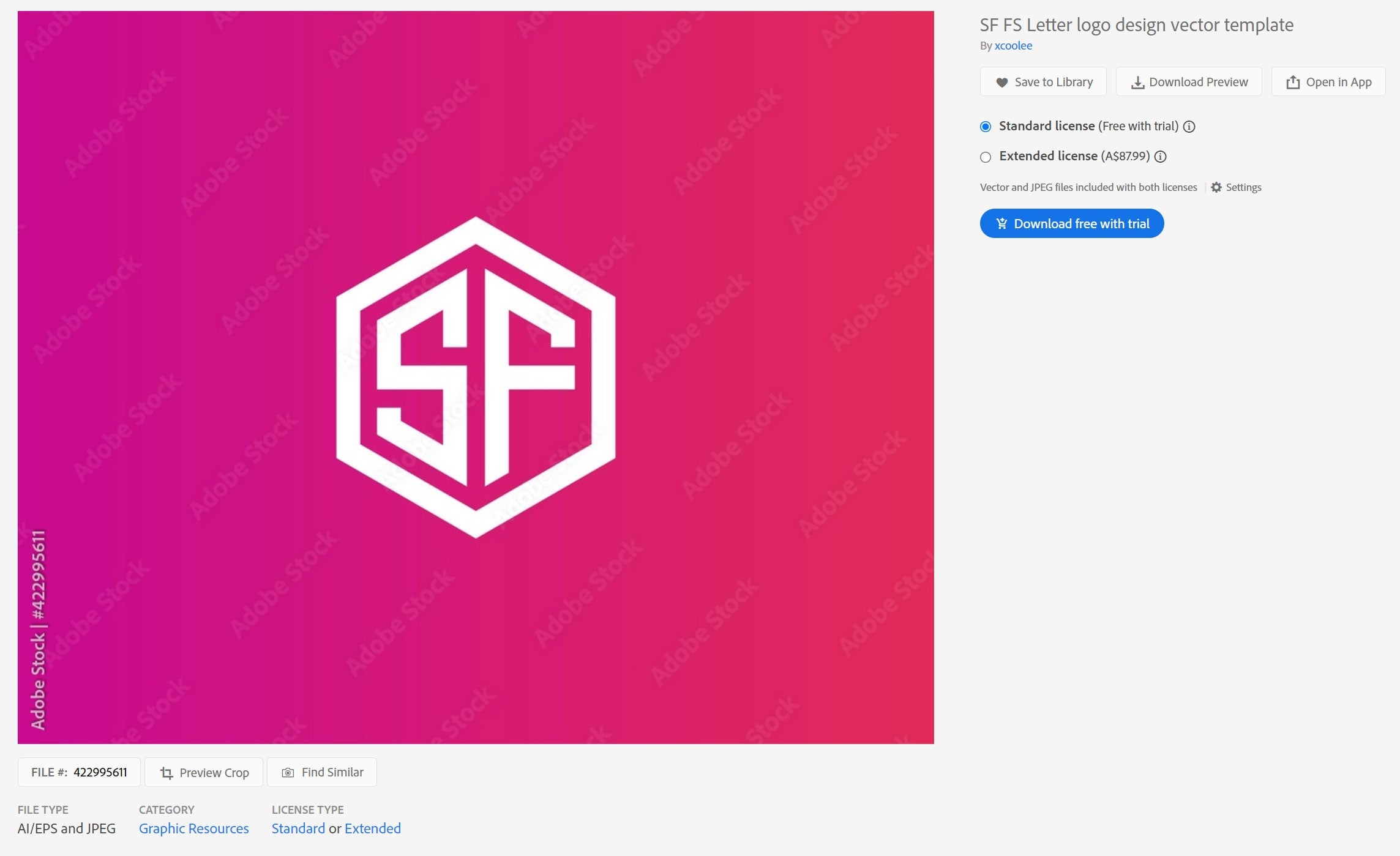
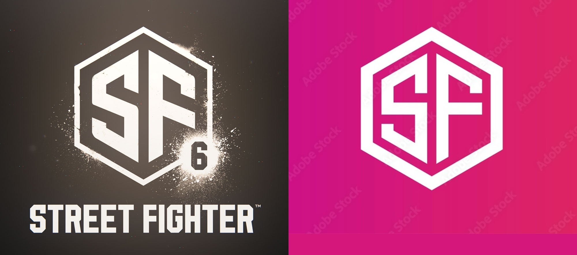
Sure, there are a few changes made, like softer angles at some corners, the tilted crossbar on the F, and a thinner border, but overall they are incredibly similar. Here they are side-by-side for comparison:
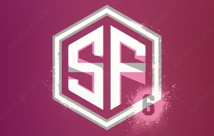
And if that doesn’t get the point across, here’s an overlay, with Capcom’s logo in white and the Adobe clipart in grey:
 Yikes. Capcom, your income hit “record levels” last year, I think you can afford a do-over on this one.
