Menus/UI
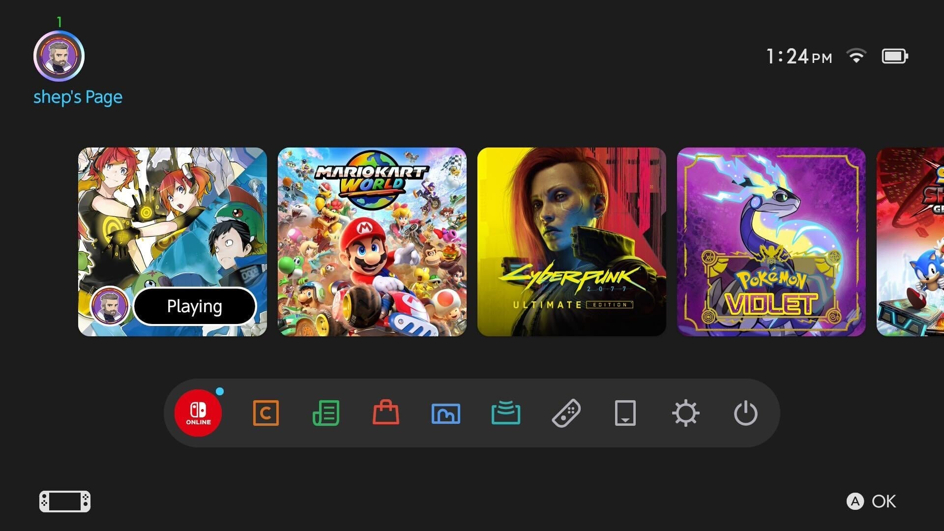
The Switch 2’s user interface and home screen are essentially carbon copies of the OG Switch. Some are disappointed by this, but I like it. For so long, consoles have tried to reinvent the wheel with each new release. And so each new console generation brings fresh menus that have to be updated and improved, as they often lack key features and options found in the old UI. But with the Switch 2, Nintendo took a page from Xbox and just copied the old UI, improved it in some small ways, and called it a day. Would I like some new themes? Sure. For now, though, the UI and menus work perfectly, and I didn’t need to relearn everything. That was nice. –ZZ
I guess you don’t have to fix what isn’t broken, but it was kind of funny to boot up the Switch 2 and see its menus look exactly like those of the first system. This is pretty standard fare for tech these days. You boot up an old iPhone, and its screen looks pretty similar to a brand-new one. However, this doesn’t happen as much with game systems. The UI of most video game consoles looks noticeably different from that of its ancestors. Though the PS5 and Xbox Series X/S kept visual elements from their predecessors, they weren’t carbon copies of the last generation. The Switch 2’s menus are faster and snappier, but if you put a gun to my head and showed me both screens side-by-side, I’m not sure I’d be able to differentiate between the two. — Kenneth Shepard
It’s fine? Hardly anything is different. The responsive eShop is nice but I’m betting performance on that does not hold up even by the end of the first year. And there’s still so much negative space in the home menu and no way to customize it. Sigh — Ethan Gach
I genuinely found the Switch 2’s UI to be profoundly disappointing. Psychically upsetting, even. There’s always that horrible moment after you’ve bought a new phone, spent all that money to buy a slightly improved rectangle, then transferred across all your stuff to realize it now just looks like the phone you already had. That was exactly my experience with the Switch 2. I did the data transfers as instructed on first booting, and then had this gut-punch moment when I looked down and saw…my old Switch. Same games, in the same order, in the same layout, with the same poorly labeled on-screen buttons. For god’s sake, they could at least have given it a punch-up, just something new. — John Walker
Nintendo knows how to be subtly charming, using cute little blips and blops to lend a sense of laid-back fun to UIs that prioritize simplicity, elegance, and ease of use. The Switch 2’s are basically a redux of the original Switch’s in this regard, and why not? That all worked fine. (Well, the eShop certainly didn’t, and it’s great to see it running so much more smoothly and quickly here, but the basic design worked fine, and that’s largely unchanged.) I do hope Nintendo gives us more options for themes at some point, as I’d love to finally have a home screen on my Switch that boasts more personality. But I’m not disappointed with what’s here, even if it does feel like a bit of a missed opportunity to drive home the feeling that you’re using a new, more powerful device than the one you’ve been using for the past eight years. — Carolyn Petit