If you’ve got a pulse and have visited Kotaku before, you probably noticed that the front page looks just a *tad* different today. Don’t worry, we can explain.
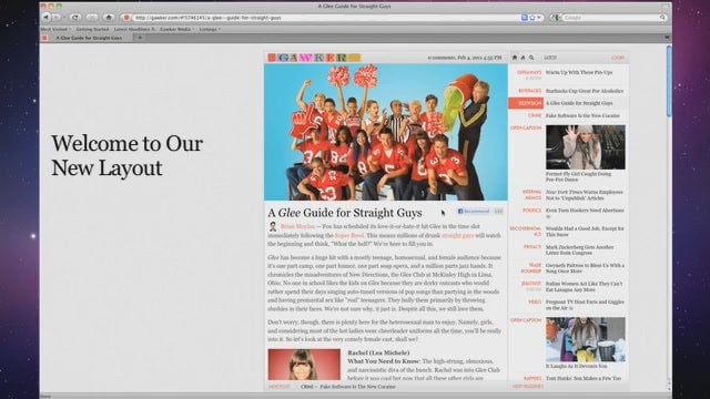
With the launch of the redesigned Kotaku you’ll noticed that one story takes up most of the page, and a list of today’s headlines in a column down the right side of the page. The page is a lot simpler and lighter, which means it will load quickly. And at last we have a way to display big, gorgeous images and videos on the front page of our site. That’s the point.
We realize that things have changed a lot, and we want to help you become master navigators of the new layout. That’s why we’ve put together this helpful guide on how to make the most of our new design.
How to scan through stories
When you come to Kotaku, usually you want to scan through a lot of stories at once. Now you have two ways to do that: Flipping through pages and scrolling through headlines.
If you like the experience of flipping through stories and glancing over the full text, video, and pictures for each one, you’ll want to use our “next post” button. It’s on the left side of the navigation bar at the bottom of the page. Clicking it takes you through the day’s stories one at a time. You can even flip through the pages right from your keyboard: Just use the right and left arrow key to page through the day’s stories. Go on, give it a try.
If you’d rather just scroll through headlines, you can use your scroll button or up/down arrow keys to move through the stories in the right-hand column, which are displayed in reverse-chronological order. There is also a “next headlines” button at the bottom of that column, for even quicker scanning.
At the top of the right-hand column, you’ll see three icons: A house, a flame, and a magnifying glass. Click the house if you want to see today’s stories. Click the flame for today’s most popular stories. Click the glass for search.
Here’s a look at how things work.
What’s in it for commenters?
If you’re a regular reader and commenter, you’ll notice right away that the site is lighter and faster. Just click on a headline if you’d like to read the story. The headlines will stay with you in the right-hand column no matter what story you’re reading. No more clicking back to the front page when you’re done reading a story. When you’re done reading a post, you can go back to scrolling through the day’s headlines, or start flipping through stories one at a time.
There’s also a big, generous space for your comments now – they’re no longer scrunched into a small column. That means your commenter name is bigger, your comments are a lot easier to read, and there’s more space for your pictures and videos that you’ve uploaded.
You’ll also find that it’s easier to change comment settings. The big navigation bar at the top of the comments section makes it a lot easier to choose whether you’d like to see all comments, or just one featured comment thread.
Comment forums will also be much more readable and flexible, but the address you’ll use to find them has changed. Here’s how you get to Talk Amongst Yourselves, our discussion forum:
kotaku.com/talkamongstyourselves/forum
Same goes for any other forum you want to reach:
kotaku.com/tips/forum
kotaku.com/speakup/forum
We even have a handy link for popular forums on Kotaku here. Remember, if you want to visit other forums, you’ll need to change the URL so that it looks like this:
kotaku.com/forumname/forum
If you are experiencing problems with anything from comments to logging in, please mail our help desk at [email protected]. Somebody will be responding to your concerns at that address 24 hours a day.
Why did you do this to me?
We wanted to make the front page lighter and simpler to scan, while also emphasizing big feature stories that we’ve written. The fact is that we spend a lot of time creating cool, original articles for Kotaku – but sometimes they would get lost in that long, long blog scroll. This way, we can splash them as big as we want! And not sacrifice load time.
For a more in-depth explanation for the redesign, you can read this post by Gawker Media publisher Nick Denton. (Gawker Media is Kotaku’s parent company.)
https://lifehacker.com/why-gawker-is-moving-beyond-the-blog-5701749
If you want to resist change, you can always view Kotaku via this classy Blogroll view – which gives you something that’s a lot like the way the old site looked. And of course you can also read Kotaku via your favorite RSS reader
Something is wrong! Something is cool! Who do I contact?
If you find something buggy or broken, you can mail [email protected] to get answers. If you just want to tell us what you think of the site, you can jump into the redesign forum


