There’s a lot to love about the wonderfully weird new Remedy Entertainment game Control, but the first thing that grabbed me were the fonts.
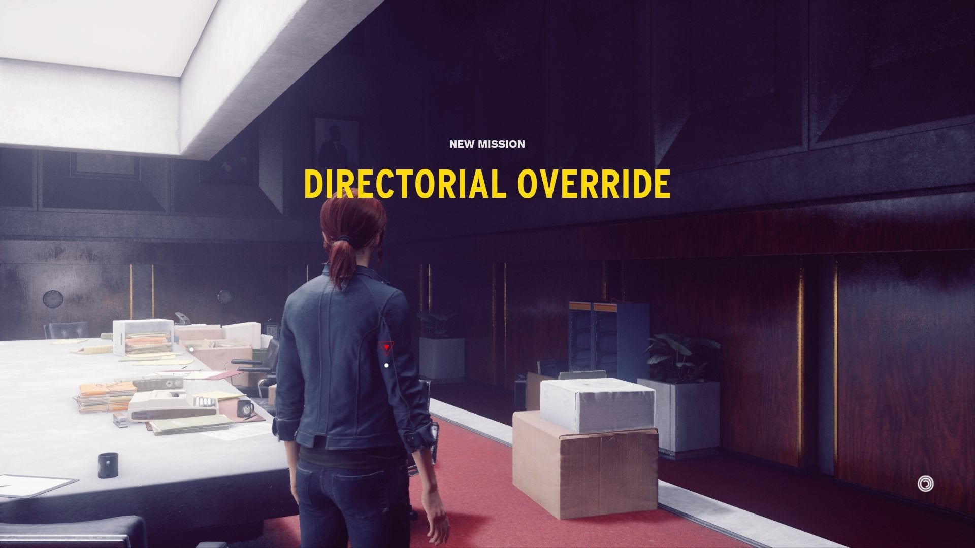
Control is a game in which the extraordinary is treated as business as usual. In it, protagonist Jesse Faden has broken into the Federal Bureau of Control, which is a government agency that catalogues supernatural happenings. The game’s UI is designed so cleanly that even the onscreen fonts serve to reinforce the authority of the FBC. For instance, every time you walk into a new area in Control, this happens:
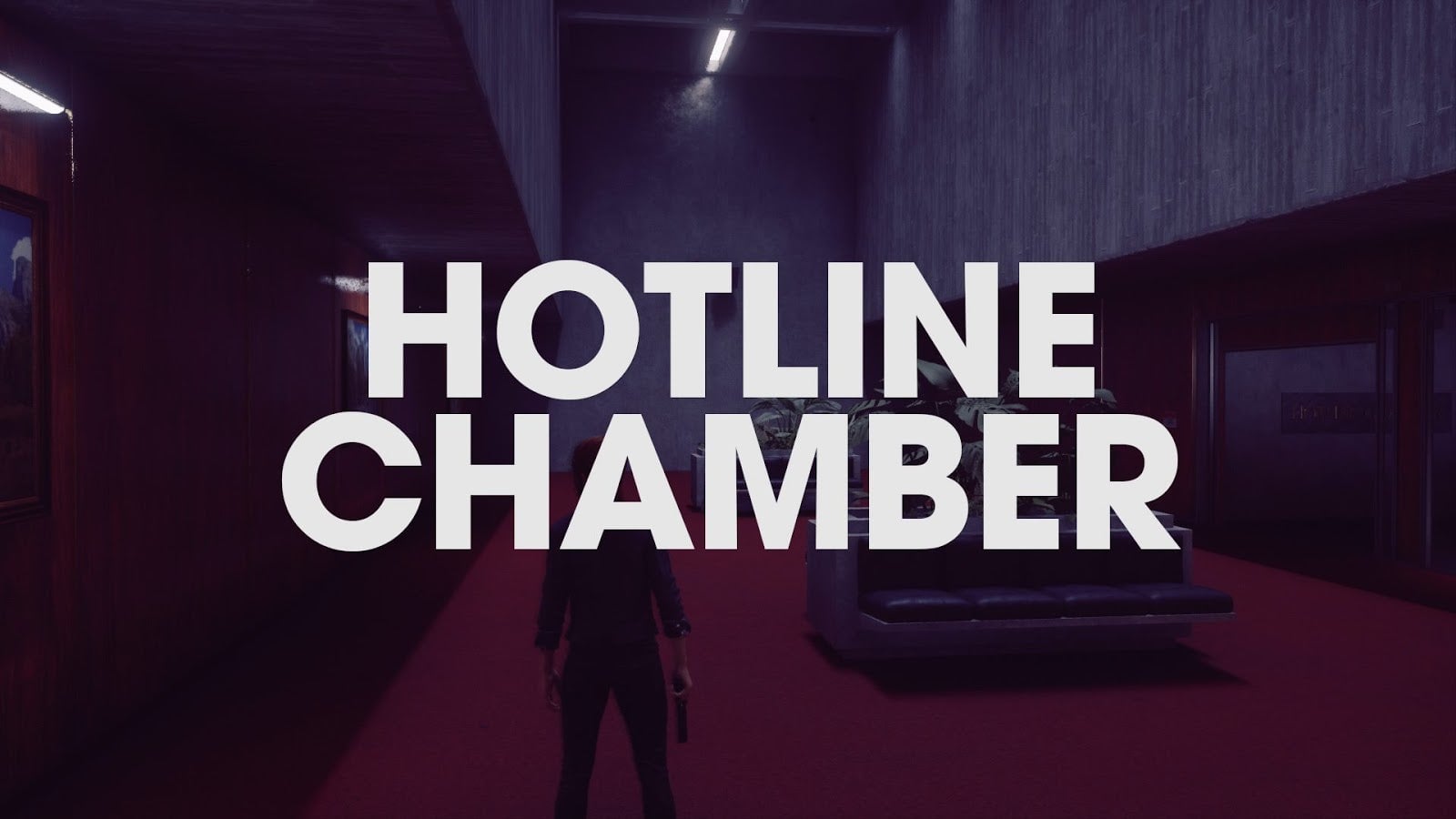 These words, displayed across the screen in a bold sans serif font, continue to display in this way even as you move your character, only fading after a few seconds. Like the brutalist architecture around you, it feels alien, slightly avant garde, and deeply sixties. What really grabs me about the phrase in the screenshot above is that perfectly circular C, which echoes the O slightly above it. These words feel definitive.
Fonts have a way of setting a tone and mood. After seeing a few of these splash screens, I started paying attention to the other fonts in the game. Again, Control takes place in a supernatural office building, and the way the typefaces are used in the game’s signage reinforce how banal the extraordinary events you’re seeing have become to the people who have been working there. The signage in the maintenance department was a standout for me.
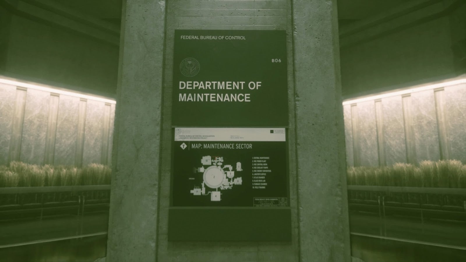 It looks like highway signage. It’s efficient, easy to read, and bold enough that you can’t ignore it. Designing for clarity isn’t an easy task, as anyone who has pushed a pull door can tell you. The fonts here are, well, controlled, showing off the authority of the government agency that houses this building. Do you want to know where you are? this sign asks. You’re in the Maintenance Department, and we will not be taking further questions at this time.
The ubiquity of fonts like these is what gives these parts of the game such a powerful connection to figures of authority, like the government. These are fonts designed to be invisible because people see them so often. Take the font Helvetica, for instance, which is actually used on highway signage in North America. It’s also used in countless other pieces of government correspondence, corporate logos, and bureaucratic correspondence. When you see something written in this typeface, but instead it’s countercultural, subversive or just plain weird, it can feel all the more unnatural. Words written in Helvetica are culturally normalized to the point of seeming incidental, so using such a clean typeface to write something off-putting can inspire some effective double-takes. When’s the last time you saw a highway exit to the Hotline Chamber?
The way that Control defamiliarizes the banal is a huge part of what is drawing me to the game. It takes place in a world where a floppy disk can give you telekinetic powers and where you talk to the Board of Directors via a magical bakelite telephone. The trappings of The Federal Bureau of Control’s bureaucracy are all over the game, displayed in the small but impactful design choices. These choices also show just how different their world is from ours.
