Hate: The same old homescreen and UI
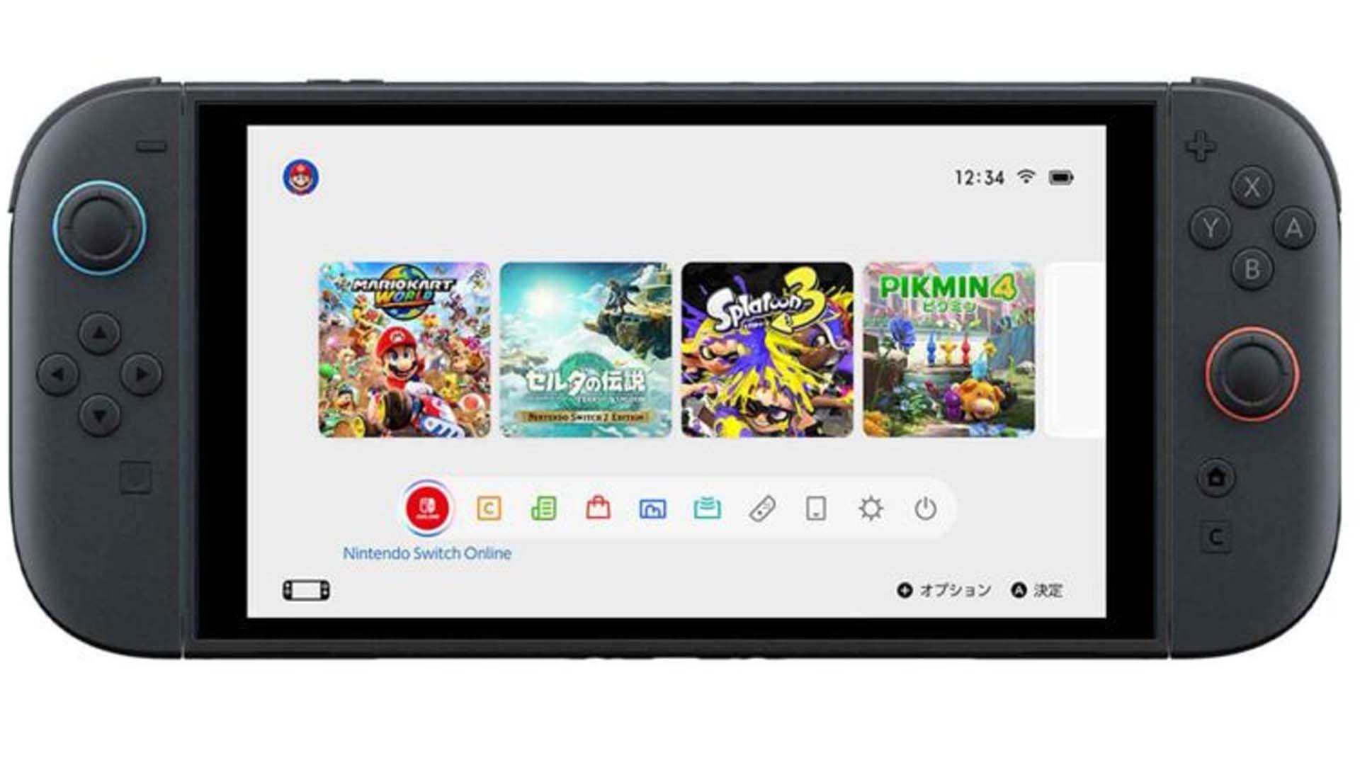
While the eShop got a nice refresh, the rest of the Switch 2 interface, sans new features like Game Chat, looks basically identical to that of the old hardware. The home screen is still a single row of game icons surrounded by a sea of white space (or black if you use the system’s only other menu theme option). The coming back from standby screen is also the exact same, with a news bar on the left, the time at the top right, and a small icon of the last active app in the middle.
Would it kill Nintendo to add some more color options, menu themes, or background art? – EG