Two years out from its release, the Nintendo Switch’s user interface design remains incredibly minimalist and barebones in comparison to other modern consumer electronics. Maybe that’s why its biggest fans get so excited about especially striking art for game icons, or in this case, icon redesigns like the one Rocket League just got.
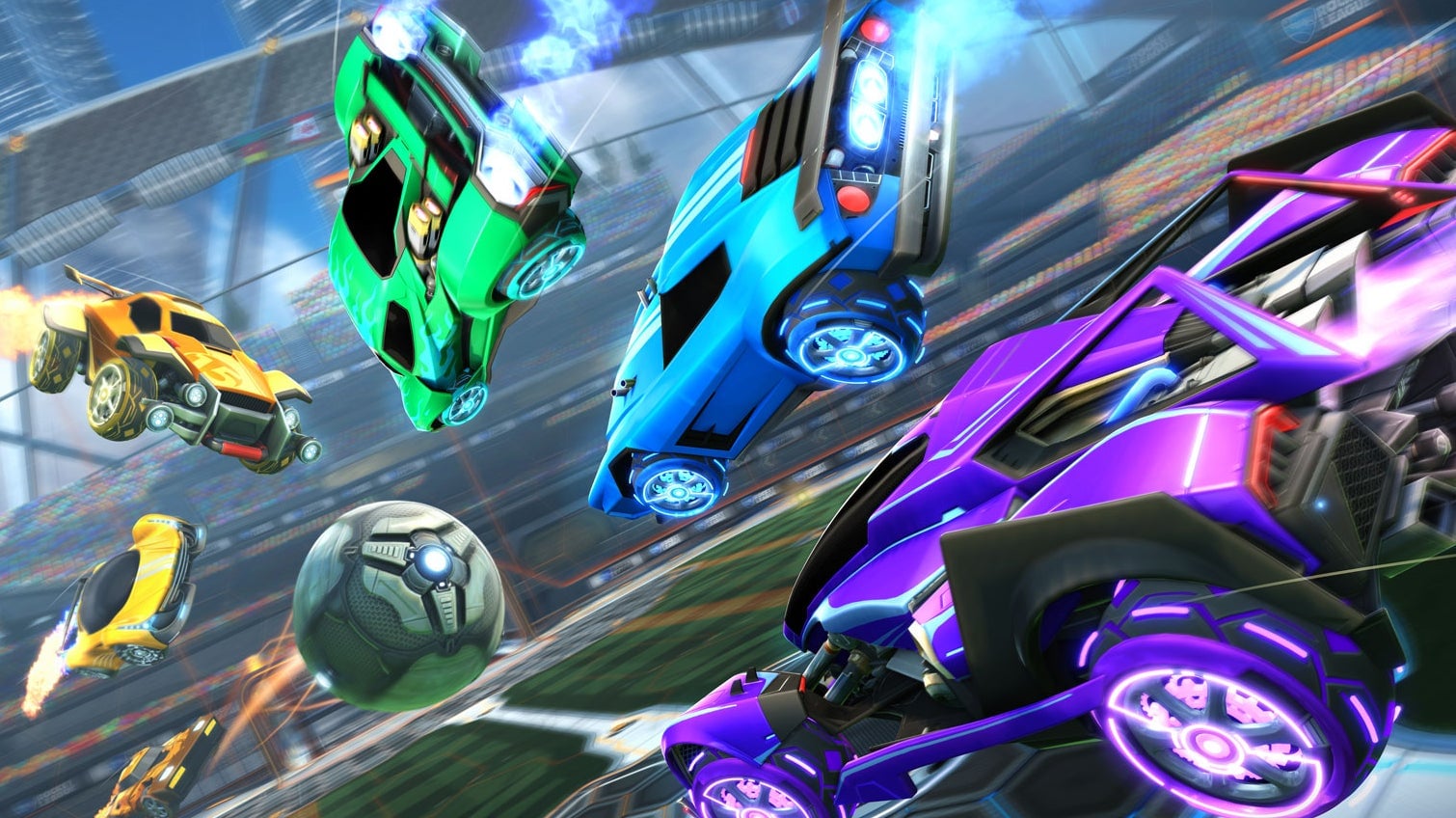
The icon used to consist of a blue shield with the white silhouette of a car knocking into a grey ball with the words “Rocket League” sitting on top. That’s how the icon always looked back to the game’s original release on the PS4 and PC in July 2015. It’s also how the game was represented on Switch, up until yesterday’s new patch. Now the icon features a spiral of shiny, metallic cars flying out of a fiery vortex with one of the game’s futuristic stadiums just out of focus in the background. This new icon was added to the PS4 and Xbox One versions of the game in a previous update but only just got changed on Switch and the console’s subreddit is wild about the new look, with a post on the subject getting thousands of upvotes.
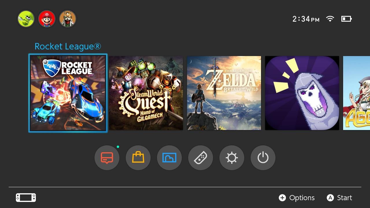 “Ugh that’s ugly, new one is way better,” wrote one Reddit user after looking at a comparison shot with the original icon. “The old one isn’t great but the new one reminds me of some cheap Hot Wheels game,” wrote someone else. “Rocket League is kind of like a cheap hotwheels game, just a really badass cheap hotwheels came,” wrote a third.
Others in the thread were confused about why so many people apparently cared about the new icon look. Switch icon enthusiasts did their best to explain. “It’s kind of a big part of the game’s presentation, it’s not like they make or break the game like some think we assume they do,” offered one player. “It’s just nice to have an icon that matches the guidelines and looks like not-shit.” Another said they only buy games if the icon art looked like someone put effort into it.
Gamer nostalgia also plays a part for some. “Because the Switch displays icons so prominently I’m kinda nostalgically reminded of looking through my game boxes with all the incredible box art when deciding what to play,” wrote someone else.
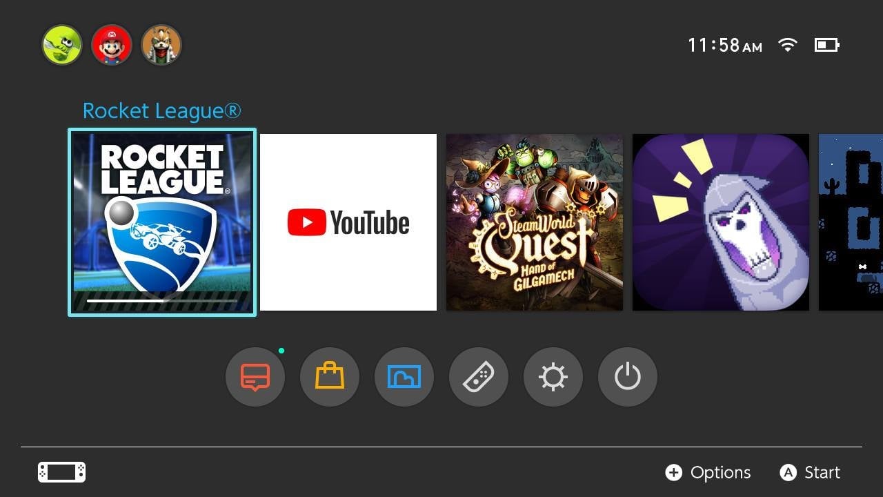 It’s perhaps even easier to understand the icon fascination when you take into account just how austere the Switch experience is as a whole, relative to how amazing its individual games are. It has just a handful of apps, including Hulu, a music production tool called KORG, the indie comic reader InkyPen, and as of last November, YouTube. There’s not a good way to browse the web on the Switch; you have to go through a complicated, multistep process to access a hidden Google search page. There’s not even a way to customize the Switch’s background wallpaper. All you can do is make it white or charcoal grey.
This puts all of the device’s focus on the single, horizontal line of game icons that runs across the home screen. These icons take up about a third of it and are otherwise mostly surrounded by negative space. No wonder, then, that people who boot it up multiple times a day take these little boxes of game art so seriously. This overarching fact of the Switch’s current user interface design has given rise to a thriving subculture around Switch icon art criticism. When Swedish game studio Image & Form teased an extremely minimalist icon for SteamWorld Dig 2, this subset of hardcore Switch owners pushed back hard.
In Rocket League’s case, the new icon arrived alongside a small patch that fixes some of the game’s Switch-specific bugs—the type of small but pleasant surprise Switch owners have grown to expect. “You people really love your Switch icons lol,” wrote MetalPug79. “With that said, yeah it does look better.”
