From 2011 to 2022, there was a video game developer in Canada known as Square Enix Montreal. A sub-division of a massive international games publisher, they had a logo that looked like a spaceship from an Atari game and a name about as unimaginative as it comes.
Here’s what I mean:
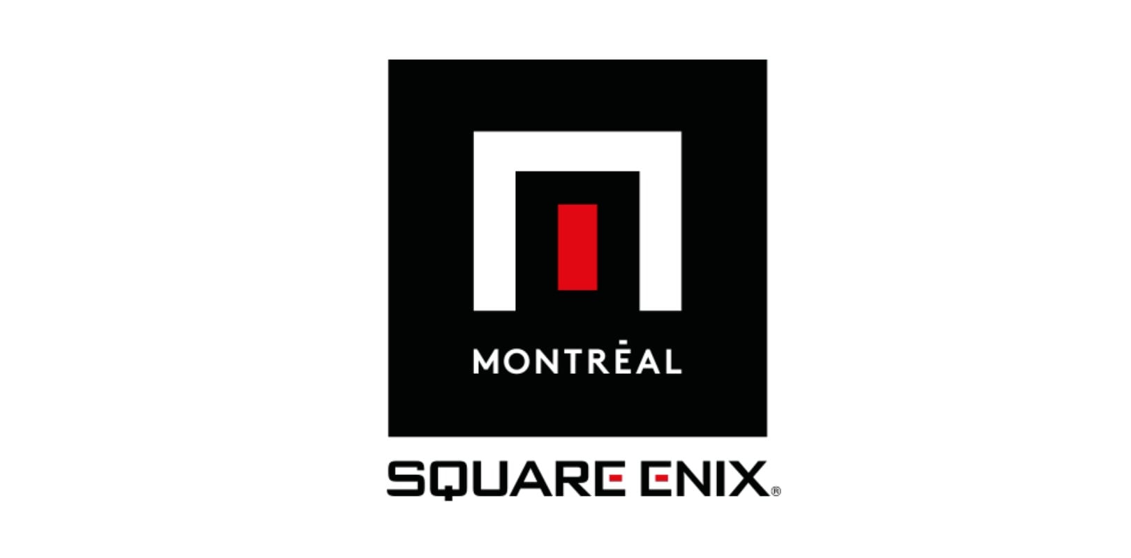
Blergh! For a video game studio that logo meant nothing. It looks like an international hotel chain, one you’d see involved in sportswashing their petro-state owners’ reputation through European football. Or maybe an over-priced fusion dining restaurant from 2008.
Now that Square Enix has sold their Montreal studio, along with Crystal Dynamics and Eidos, they no longer have to carry that corporate branding. They can branch out and do something else, something new, something more befitting the studio’s (quite frankly stellar) output over the last decade. After all, they released a succession of games (Deus Ex Go, Hitman Go, Tomb Raider Go) that redefined the whole concept of a spin-off or mobile port.
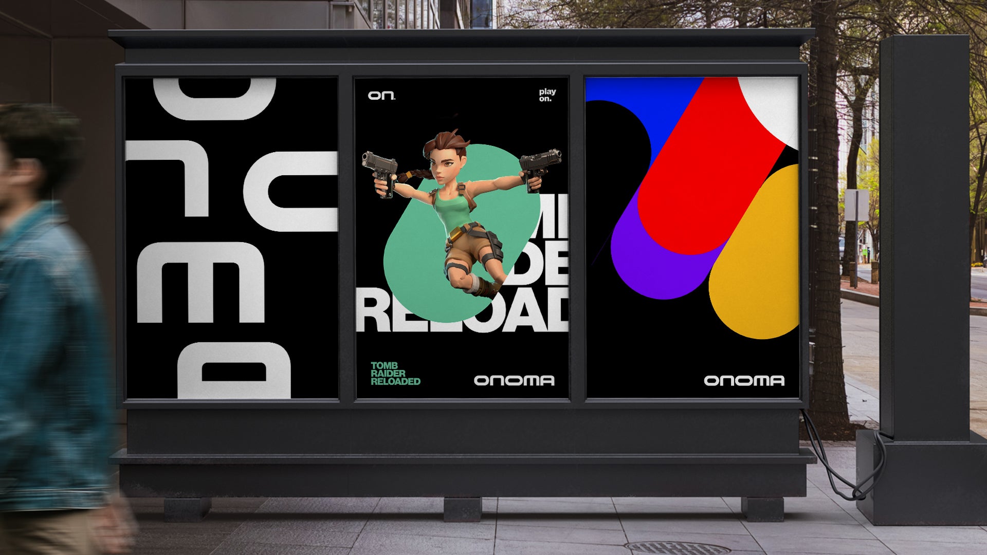
The team announced these changes recently, and I love them. The studio will now be known as Onoma, with a logo that looks like this:
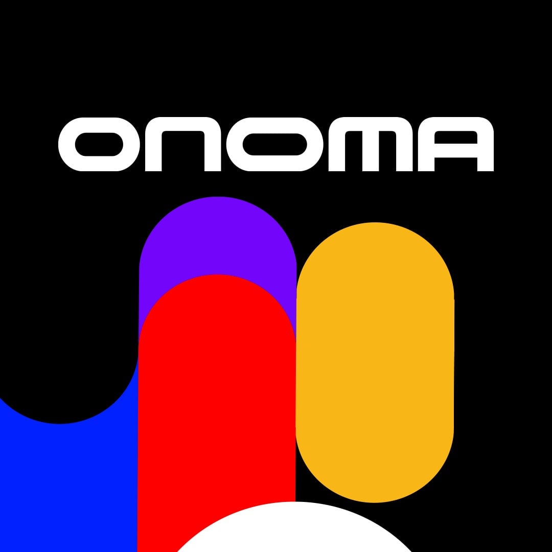
Onoma is a decent gag for a studio name because, well, it just means “name” in Greek. I’m a huge fan of the colours and blobs though, because they remind me instantly of so many other things that dovetail so nicely with the team’s own back catalogue and focus, from clean sci-fi imagery (think Designers Republic/WipeOut and Moon) to simple, gorgeous mobile games like LocoRoco
That’s about the extent to which I’m willing to look into this; the team have a whole blog up about the changes if you’re into their more market-y explanations behind everything. But as someone who has been a long-time enjoyer of studio logos, I just wanted to blog about this one because I thought it was nice!