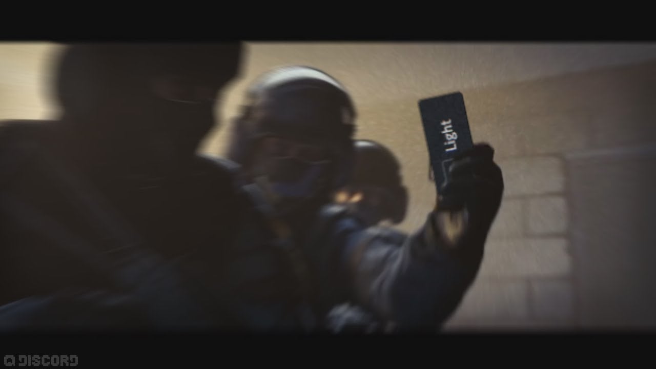
The long, contentious list of things that divide us—dogs vs. cats, Democrat vs. Republication, ketchup vs. mayo—has an entry just for gamer aesthetes. There’s a war among Discord users over whether people who use the gaming chat app’s “light” theme are wicked, infernal hellbeasts or normal humans who like white backgrounds.
Discord’s signature look is dark. On top of a default gray background, users type in white font. Compared to other chat apps like the more office-friendly Slack, Discord’s got a look that appeals to denizens of the night. It also falls squarely in line with the shadowy look popular among gaming apps like Battle.net, Epic Games’ launcher and, of course, Steam.
It turns out that, underneath that doomy exterior, Discord’s got a “light” theme, too. And boy, is it light. Turning it on after months of Discord “dark” feels blinding. It’s a bleached, stark white with medium-gray font. It’s like looking outside your window at a six a.m. sunrise after grinding on Diablo 3 all night. It hurts me:
Of course, there are Discord “light” apologists. Some people just think it’s easier to read (probably, they are the same people who wear sunglasses inside). The great majority of Discord users, apparently, think those people are wack:
People who use Discord's light theme be like pic.twitter.com/eNf2yqa5LP
— Deffy (@Deffynitely) April 16, 2018
You haven't experienced true bullying until your peers find out you use discord light theme
— m (@m_feiti) March 15, 2018
https://twitter.com/embed/status/980797788081606657
imagine falling in love with a girl to find out she uses discord light theme
— ObRa (@obscuredraven) March 8, 2018
https://twitter.com/embed/status/974753150434533378
https://twitter.com/embed/status/983178937747505152
https://twitter.com/embed/status/965721241830264832
Even Discord is in on the joke:
Rare photo of a Discord developer working on light theme pic.twitter.com/Gz9d4x0oJX
— Discord (@discord) March 14, 2018
Sure, someone might ask, “Who cares what color scheme you use on your private gaming chat app?”. I don’t have a great answer, but I do have the truth: a lot of us.


