
When veteran developers Rare changed their logo earlier this week, it got me thinking about other studio’s brands, and how a good logo can really help define what a developer is all about.
https://kotaku.com/one-of-the-oldest-logos-in-gaming-is-no-more-453107688
Take Epic Games, for example. The company’s logo is awful, just awful, but at the same time, it does its job: Epic is a studio specialising in graphics technology, biceps, neckless men and large guns, so it makes perfect sense for their logo to look like something you would have found on the box of a graphics card in 2002.
I don’t want to spend tonight talking about logos that only “do their job”, though. I want to talk about ones that are great, not just on the merits of the company they represent, but in their own right as well.
To that end, I’ve picked some of my favourites. My criteria was this: just like any great piece of corporate branding, from Ford to Polaroid, it had to be timeless. Something that won’t just look good the year its first designed, but will look (or has looked good) for decades.
To do that, a logo can’t look like a comic book from the 1990s, or something you’d find on the cover of a European dance album. It has to be simple, and it has to be stark, both so that it can be easily identifiable from any angle at at any size, and also so it can weather the winds of style and fashion that whip through the design world once or twice a decade.
Here, then, are my favourites, whether they be developer, publishers or both. Feel free to chime in with your own, and if it’s something I’ve forgotten about or overlooked, I’ll throw it right in!

Zoe Mode (Chime)

SCE Japan Studio (LocoRoco, Ico, Shadow of the Colossus)

Lionhead Studios (Fable, Black & White)
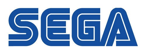
Sega (Sonic, Jet Set Radio, Outrun)
Polytron (Fez)

Foundation IX (Outrun 2, Marvel vs Capcom 2 XBLA/PSN)

Capcom (Street Fighter, Resident Evil)

Konami (Metal Gear Solid, Pro Evolution Soccer)
Rockstar (Grand Theft Auto, Red Dead Redemption)
Nintendo (Mario, Zelda)