It’s 2023, and Kotaku has a new look. Those of you who regularly read our homepage are probably noticing all sorts of changes, from the layout to the colors and even how pictures are framed on the page. So, what gives–and what’s new?
Frankly, it was time for an update. Luke, our resident visuals guy who regularly runs a game art column, was slowly being killed by the fact our images had rounded edges for some reason. And if the gaming industry can remake a game that just released a few years ago, Kotaku can have a little graphics update as a treat. It’s been a good while since we got a tune-up
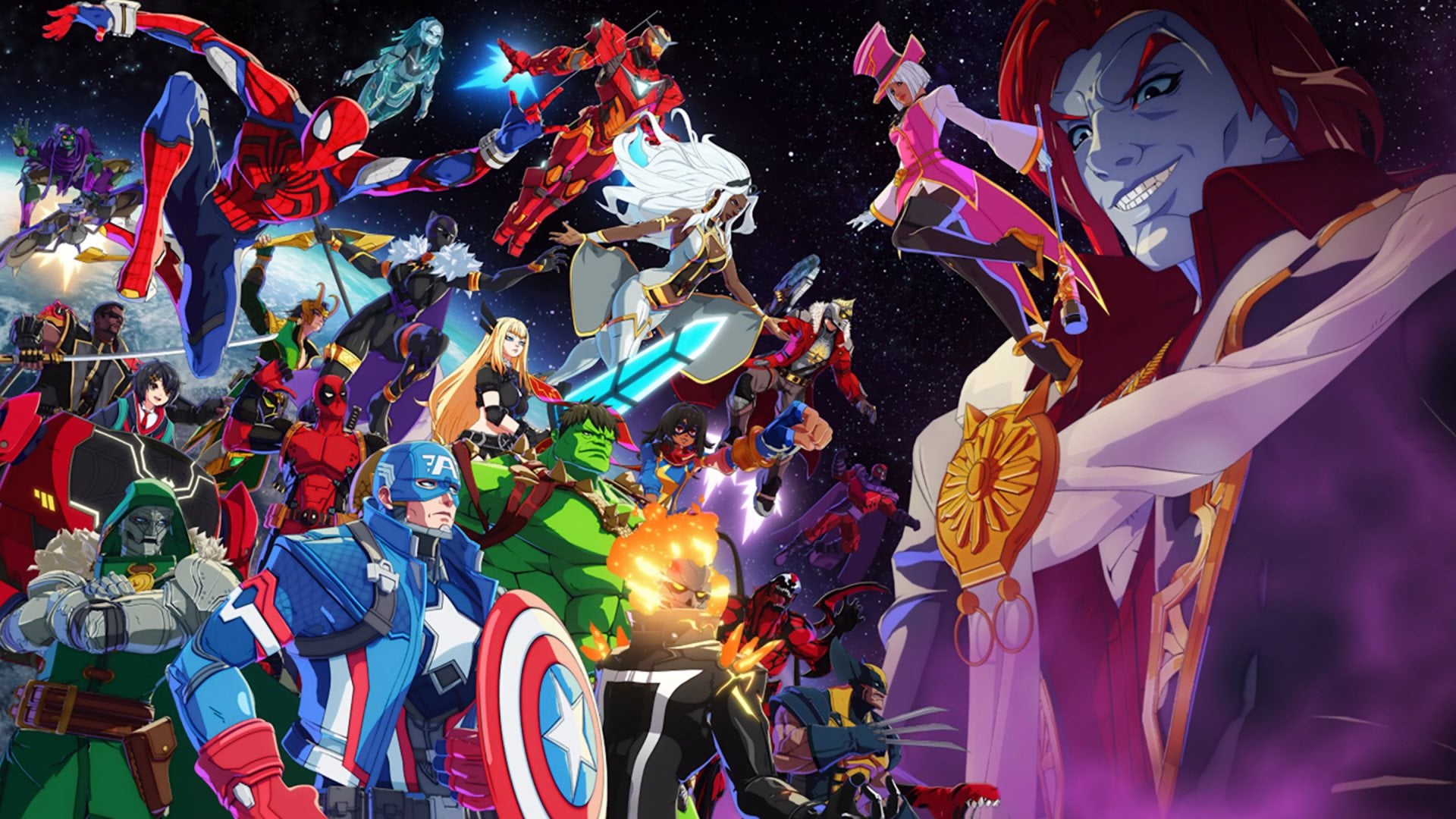
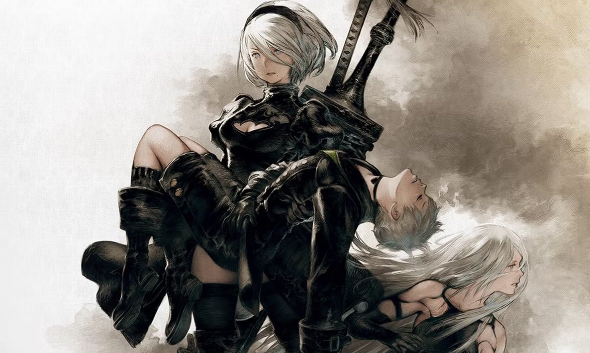
The hope, beyond finding a better way to present more of our biggest stories to you, is to give the site a more distinctive look than what you’ll find at our sister sites. I’ve been joking about graphics, but games are things we like to see, so the top of our fold is more image-oriented than other things on the network. We want you to enjoy the GIF of the hot new game in its full glory, or more likely, the great Photoshop that Zackor Isaiah cooked up. And while I’m sorry that we can’t give you a dark mode outright, I hope you enjoy the cool new colors on the nav bar.
What else? Things are organized a little bit differently, with sections for the type of content that you’re likely looking for (including an area devoted to specific platforms, a first.) Now you can see what’s trending on the site, in case you were curious to see what other Kotaku fans are reading right now. But overall, it’s the same website you know and love–just with a fresh coat of paint.
Of course, you can always simply read our site on the latest tab, which presents things in descending chronological order. But then you won’t get to see how everyone is reading about a Twitch streamer’s feet right now. Your call.