Call of Duty: Modern Warfare 2 is ostensibly a game about shooting people in the face. But like lots of other modern games, it’s also about playing dress-up and navigating an endless sea of unlocks and monetizable cosmetics. While the shooting is good, the stream of menus in-between has some players raging and wishing Infinity Ward had simply stuck with the layout from 2019’s Modern Warfare franchise reboot.
With the game officially out today on PlayStation, Xbox, and PC, many players are running it for the first time and going “what the fuck” as they’re bombarded with menus, icons, and widgets that both overwhelm and confuse. The general vibe is that of a new streaming service or mobile app, where you’re constantly being upsold through ads as different pieces of content scream over one another for your attention. It’s not unlike how the overhaul coming to the Xbox home screen looks like a giant Game Pass billboard
One of the biggest culprits is the horizontal alignment of the tiles for everything from gun barrels to camo texture. Rather than scroll up and down, as PC players and their console counterparts have done for years, the options now go left to right. Instead of being able to drill down through specific categories of camos, for example, players have to flip through a single giant repository. God help you if you want Frattura, the very last one on the list. “Why the fuck did they hire someone from Hulu to design all the UI?” wrote one player on the Modern Warfare subreddit

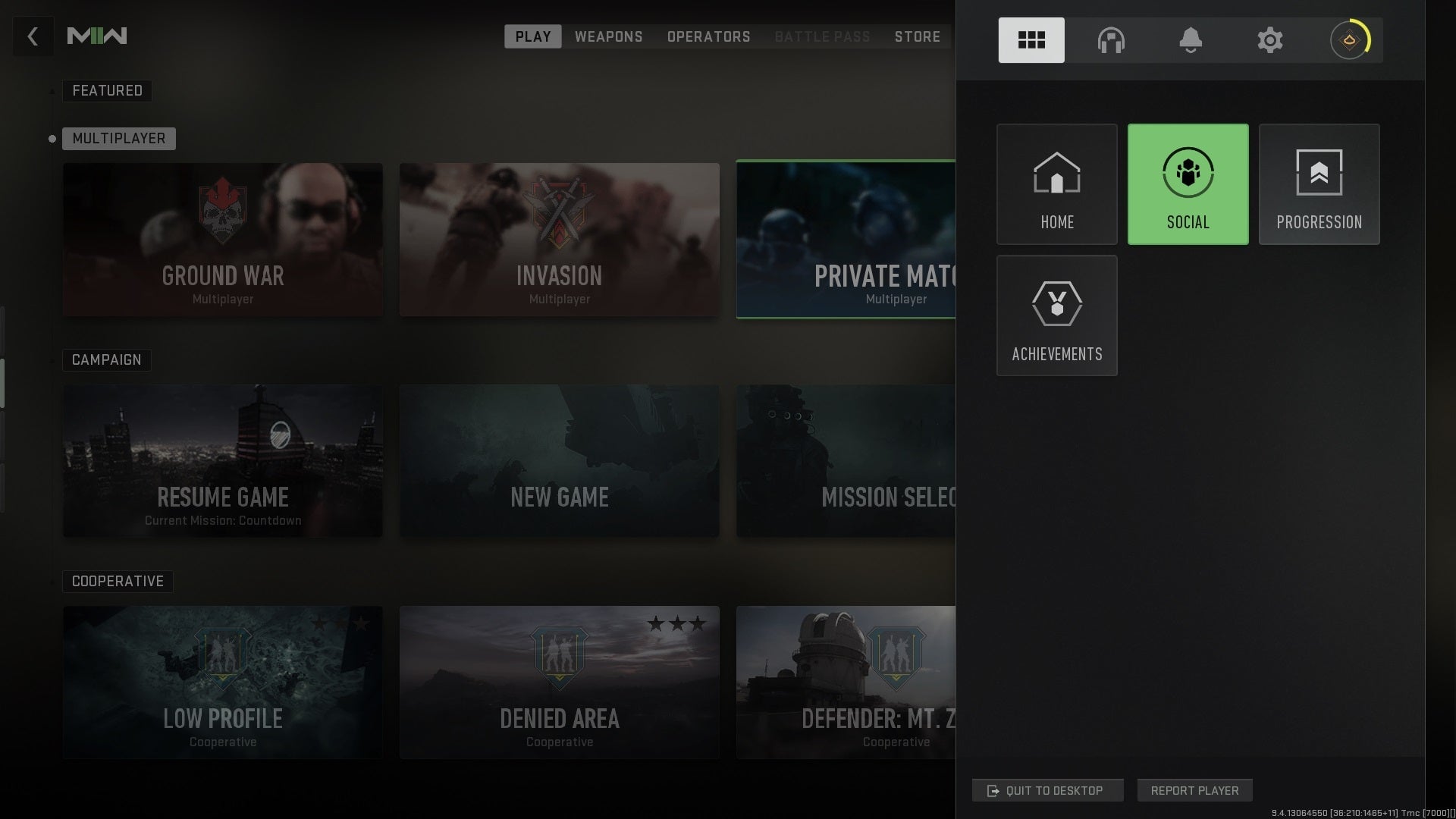
The main menu screen is also a source of frustration. Rather than separate out the campaign, multiplayer, co-op missions, and other modes, everything is mashed together. Some of the icons are super big, while other options, like for changing Quick Play settings, are very tiny. And then there’s the back button, which you might think would take you back one step in the menu interface, but instead cancels out of it entirely.
The issues range from unintuitive to inefficient, and have lots of players pining for the less flashy but simpler to navigate UI from 2019’s Modern Warfare. “Horizontal tiles are bad enough for a streaming platform but they’re absolutely fucking nonsensical for a game like CoD,” wrote antoher player. “They could just use the old UI from MW19 and it would be way less work than this shit.”
I think about this often my man. The OG CoDs had perfect UI and lobbies. Things to the left and player names to the right..
Look at this now.. I massively dislike this interactive big ass show your soldier looking menu stuff 😭 pic.twitter.com/Ut6Ncqg1sd
— Greencade (@greencadecom) October 28, 2022
Design overhauls are always controversial, but players have been complaining about the UI for MW2 going back to the multiplayer beta a month ago. The tiles, icon sizes, and placement are the main culprits, with players accusing the game of mimicking a layout more conducive to mobile. But the broader issue is just the overall complexity of getting to the simple pleasures people come to Call of Duty for: customizing guns and racking up kill streaks.
Infinity Ward acknowledged UI feedback back during the first phase of the multiplayer beta. “We’ve seen the feedback around difficulty editing perk packages, managing loadouts and accessing the armory,” it wrote in September. “We have identified some UX issues as well as some bugs—these are things we won’t be able to adjust in time for Beta Weekend Two, but they are top of mind ahead of launch.”
It’s not clear if future tweaks are on the way or still in the discussion phase. In the meantime, the gameplay itself seems decent so far, and will certainly be a welcome change for players disappointed with the multiplayer in last year’s Call of Duty: Vanguard. Unless, that is, you love stomping random strangers in quick play and hate skill-based match-making, in which case you’re out of luck


