Last year, Japanese publisher Bandai Namco announced that it was doing away with its logo, the same one it had used since the two formerly separate companies merged all the way back in 2006.
“Our current logo expresses the fusion of Bandai and Namco that was created when the two companies integrated,” a statement said back in September 2021, explaining why for 16 years one of the world’s biggest video game publishers has had a logo that was basically two coloured blobs smooshed together.
The new logo revealed was less cooperative, “[reflecting] our new purpose” as a single company. It swapped out the blobs for a Nintendo-esque border, and the sunset colour palette was replaced with black and pink.

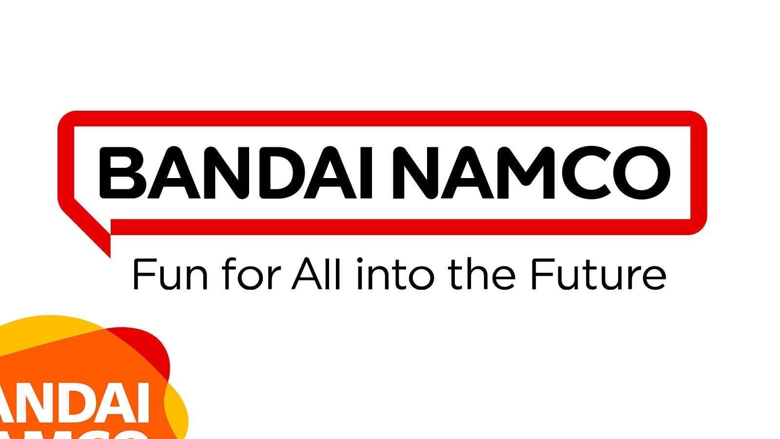
It was not well received, which perhaps explains why we’re only now seeing the logo appear on the company’s products now, over six months later, including some changes. The pink border has been replaced with a red one:
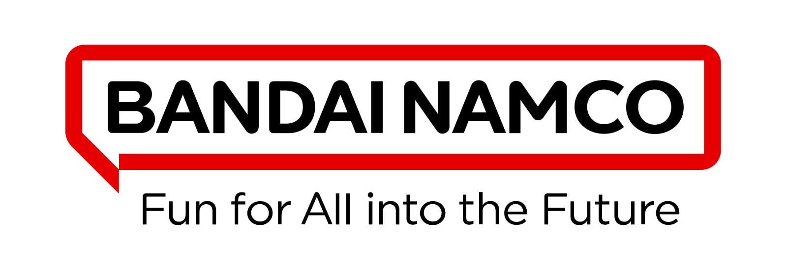
Which in some ways is a clearer callback to the old Namco days, and in others makes it look like a street sign. Which in turn makes me think of:
But whatever! I still like it, despite the amount of shit it is getting from folks. It’s a clear improvement over the old logo, which was horribly dated and looked more like something you’d see in a model train shop (which, given Bandai’s history in the scene, was maybe the point!), or as the logo of a 2000s kids’ TV show.
The new one is clearer, easier to scan (street signs are designed like that for a reason!) and I particularly like the little “speech bubble” hook in the corner, which breaks things up. Here’s how Bandai Namco explain that little quirk:
The new logo’s speech bubble motif, “Fukidashi” in Japanese, expresses the potential of the brand to connect with people around the world and inspire them with amazing ideas. The speech bubble also represents Japan’s manga culture that has become so popular everywhere. The logo stands for our determination to communicate with fans worldwide, to connect with our fans, and to create entertainment unique to Bandai Namco. The magenta used as the motif color not only represents diversity, but also creates a bright and fun impression and is easy to reproduce.
Like I said, despite the old-ish announcement this is only just starting to roll out now, so anyone picking up, say, a late copy of Elden Ring will be seeing the new logo instead of the old one:
Bandai Namco's new logo is now on copies of Elden Ring https://t.co/7x1uXBhlN5
— Wario64 (@Wario64) May 5, 2022
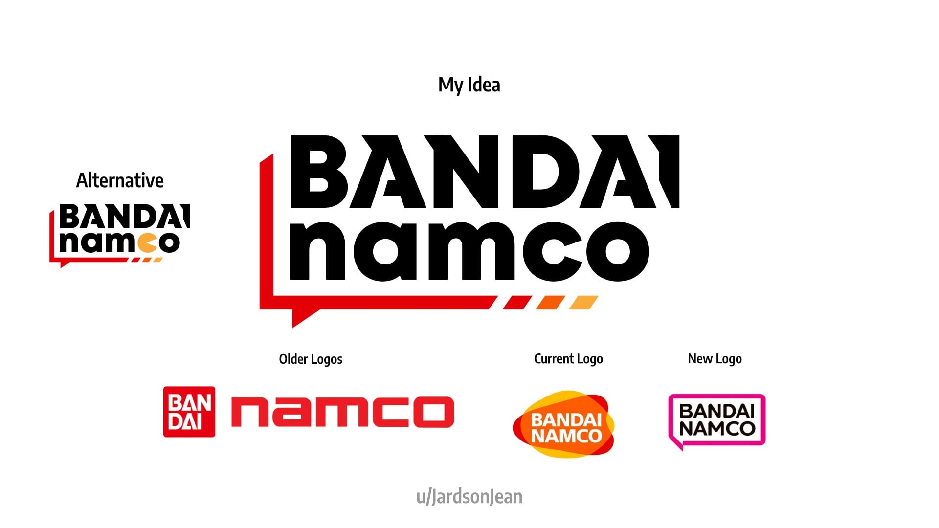
One more thing before we go: if the official corporate offering is not to your liking, maybe this amateur take, which leans more heavily on the past, is:
