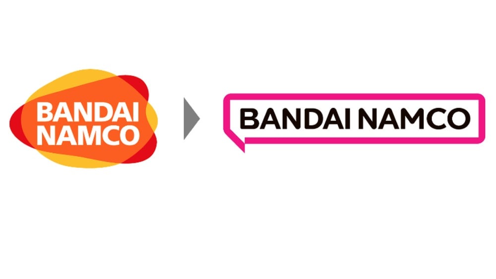
In 2005, Bandai and Namco merged, and the following year, Bandai Namco was born. To mark the new conglomerate, the company got a yellow, red, and orange logo with the company’s name in white font. It’s not a bad look, and stands out among Japanese game companies. But next year, Bandai Namco is getting a redesigned logo, and so far, the buzz is not good.
According to Bandai Namco, there is a reason for the redesign—namely that the new logo reflects the company’s new purpose.
“Fundamental to our Purpose is the idea of connecting and working together to create things,” said Bandai Namco Holdings president Masaru Kawaguchi Bandai. “Namco’s entertainment connects fans all over the world. By delivering fun to the people everywhere, we put smiles on their faces and help them achieve happiness. That’s why Bandai Namco exists.”
Okay. But your new logo sure doesn’t seem to be making fans happy. Below are a selection of comments from Japan’s largest bulletin board, 2ch:
They really thought this was good?
It’s just letters.
This is so dull.
This looks like something I could make.
I like that it’s simple.
It doesn’t look like a Japanese company.
Looks like Twitch’s logo.
No personality.
When I look quickly at it, I can’t tell it’s Bandai Namco.
The previous one was better.
This for real? It’s so shitty.
The font is fine, but the way it’s bordered is not cool.
It’s too simple. Just glancing at it, there’s no branding.
It’s fine. I don’t really care about logos.
Video games are fun so make a funner logo.
And the orange logo was so nice.
It’s better than before.
Is it really necessary to change the logo?
But what do these folks know? Bandai Namco says there is a concept behind the design. It means something! Here is the official explanation:
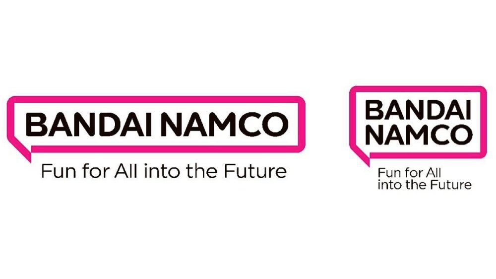
The new logo’s speech bubble motif, “Fukidashi” in Japanese, expresses the potential of the brand to connect with people around the world and inspire them with amazing ideas. The speech bubble also represents Japan’s manga culture that has become so popular everywhere. The logo stands for our determination to communicate with fans worldwide, to connect with our fans, and to create entertainment unique to Bandai Namco. The magenta used as the motif color not only represents diversity, but also creates a bright and fun impression and is easy to reproduce.
The new logo will go into use starting April 2022. The current one is way better.