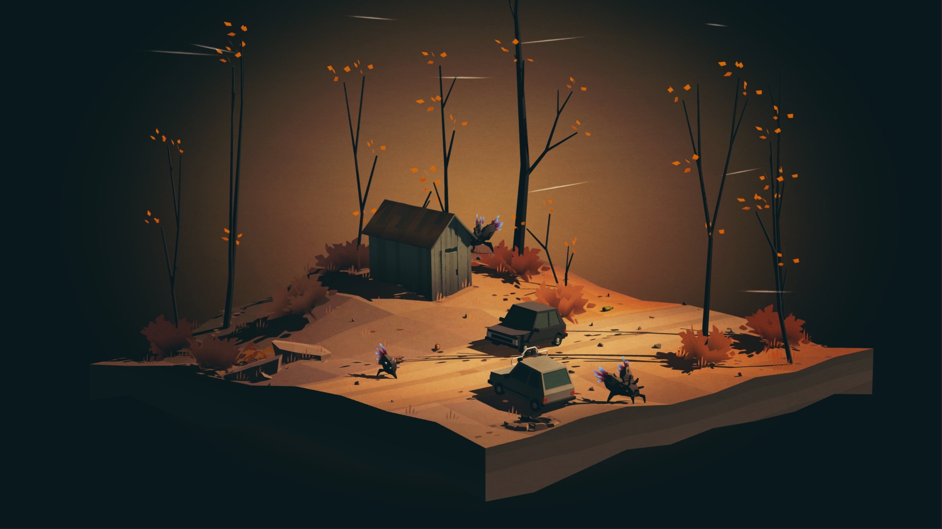
Overland, the road-tripping survival game that Kotaku editor Riley MacLeodrecently described as an “indie rock XCOM,” is often unforgiving by design. During development, however, the developers realized it was also challenging in one way they hadn’t intended: the font was too difficult for players with dyslexia to read.
At last year’s PAX East in Boston, according to the game’s co-designer Rebekah Saltsman, one player approached the developers and said that it was difficult for them read the on-screen text due to their dyslexia. This added a new accessibility goal to the Overland team’s pre-launch worklist.
“I think about this and other accessibility options a lot,” Saltsman said on Twitter. “How do we signal that games aren’t ‘for you?’ I want people to play. And a lot of play engages with failure, but the way our brains process letters shouldn’t be what we are failing at, the way our eyes see color shouldn’t be where we fail, the way our bodies can use controls shouldn’t be where we fail.”
Dyslexia is defined by the Mayo Clinic as “a learning disorder that involves difficulty reading due to problems identifying speech sounds and learning how they relate to letters and words.” Folks with dyslexia often share symptoms like non-existent movement in text and a confusion between similar letters like ‘b’ and ‘d’, all of which can add up to a very frustrating experience. As video games have become more and more popular, dyslexia accessibility has remained a sticking point for those that struggle with this disorder.
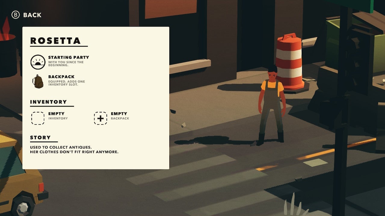
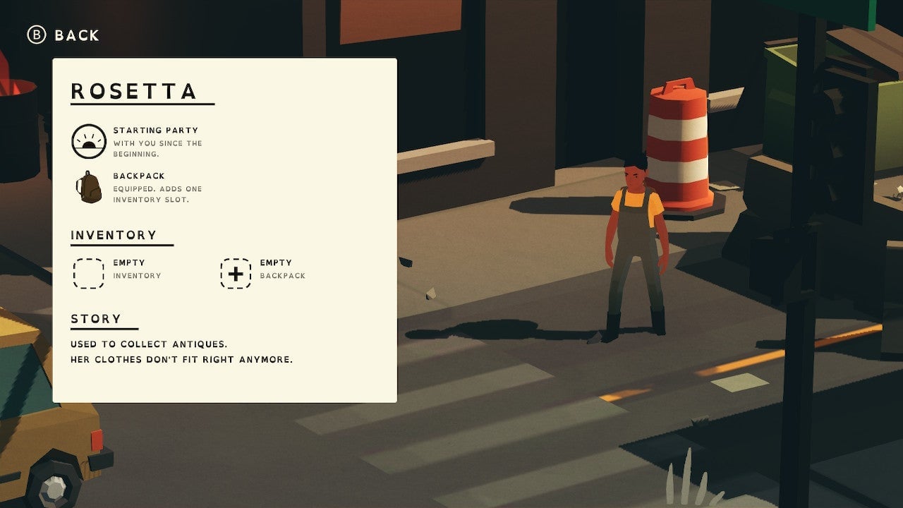
When I first booted up Overland on my Switch last week, I was surprised to find it included an option to replace the basic, in-game fonts with one that’s more friendly to the dyslexic brain known as OpenDyslexic. The differences are subtle, but anecdotal accounts indicate that folks who are have found this option very helpful.
OpenDyslexic is an open-source, free-to-use font that aims to improve readability for those with dyslexia by adjusting the text in various ways. The wider spaces give letters more room to breathe, and the weighted bottoms help differentiate between the letters that dyslexia tends to mix up or even flip upside-down due to their similarities. These are very subtle adjustments that don’t impair reading for the average user but mean the world to at least one dyslexic gamer.
The Last Door, an adventure game released by Blasphemous developers The Game Kitchen back in 2013, featured a similar font as part of its accessibility options. Their research indicated that just under 14% of The Last Door players utilized the dyslexia-friendly font, and while that doesn’t mean that many people who played the game were dyslexic, it does show that a significant portion of the userbase found the option either useful or at least preferable to the default text.
Accessibility continues to be an important talking point in the world of video game development, and thanks to organizations like AbleGamers, there have never been more resources for developers to utilize in making their games enjoyable for more players. Although the science behind the efficacy of dyslexic fonts is still up for debate—the creators of OpenDyslexic themselves are very open about the font not working for everyone with dyslexia—it’s clear that the work being done by developers such as Finji and The Game Kitchen is important to bringing more gamers into the fold.
