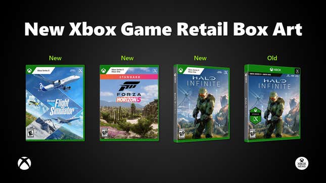
Less than a year after launching the Xbox Series X|S, Microsoft is changing the standard box art for the console’s games in an effort to make it easier for customers to tell with which Microsoft console they’re compatible.
Xbox News first spotted the change:
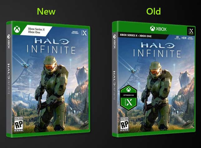
Let’s zoom in and get a closer look:

So they’re swapping a small black bar out for a larger white box, and removing the old green band from along the top of the box and replacing it with a small Xbox logo on the left. The smart delivery and Series X logos remain at the top right, but are now printed straight on the game art instead of inside the green band.
The change is already taking place on press and retailer listings for upcoming games:
I like it! I actually really like it. All the same info is there, but the smaller Xbox branding is cleaner, and the black text on white background is much easier to read, as well as being quicker to draw the eye. Best of all, it gives the cover art itself a little more room to shine.
Of course this may never have been needed if Microsoft could just name their consoles like a normal company, but we’re well past the point of hoping for that, so cleaner revisions are our best-case scenario.

