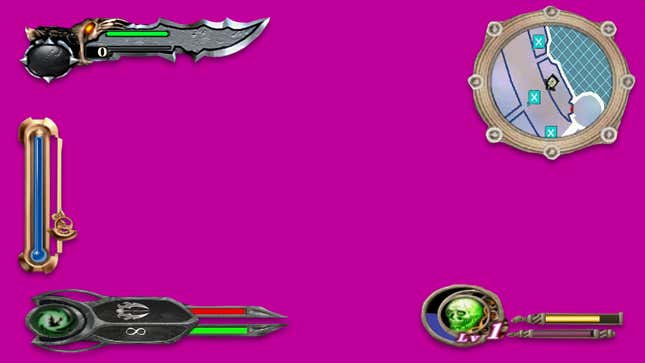
Video games look really good these days. I boot up almost any PS4 game released in the last few years and I’m impressed. But while games might look nicer than ever before, we lost cool looking “heads-up displays”, HUDs, in the process. Was it worth it?
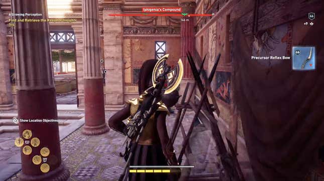
I’ve been playing a lot of Assassin’s Creed: Odyssey lately. A lot. And it got me interested in the past games, most of which I played long ago when they first released. In going back and looking at these games, I immediately noticed something. Their HUDs were so much cooler than what’s in Odyssey.
Here’s a screenshot of Odyssey via Stephen’s wonderful post about an annoying bow that he kept finding.
Now here’s a screenshot of the first Assassin’s Creed via WSGF.com.
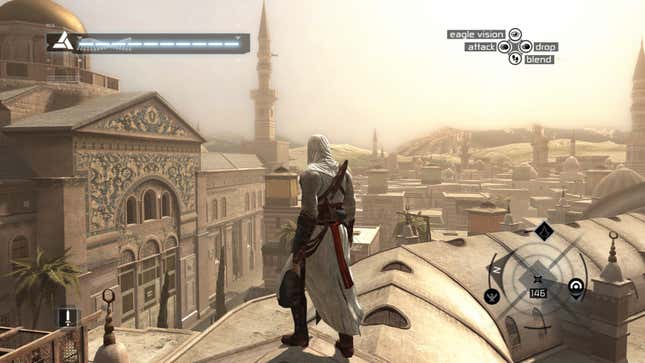
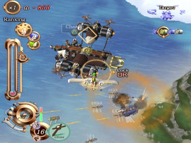
Look at the weird map! And the cool looking DNA-inspired life bar. I also like how high contrast it feels. Odyssey’s HUD is clean and efficient. It gets the job done, for sure, but it lacks personality. And if we go back even further, to the PS2 era of gaming, we can find even more wild HUDs, as pointed about by Twitter user @BlacWeird a few months back.
Here’s what the HUD looked like in SkyGunner. It’s got a steampunk vibe to it.
Or how about Project Snowblind. What is happening in that mini-map in the top right? I have no idea.
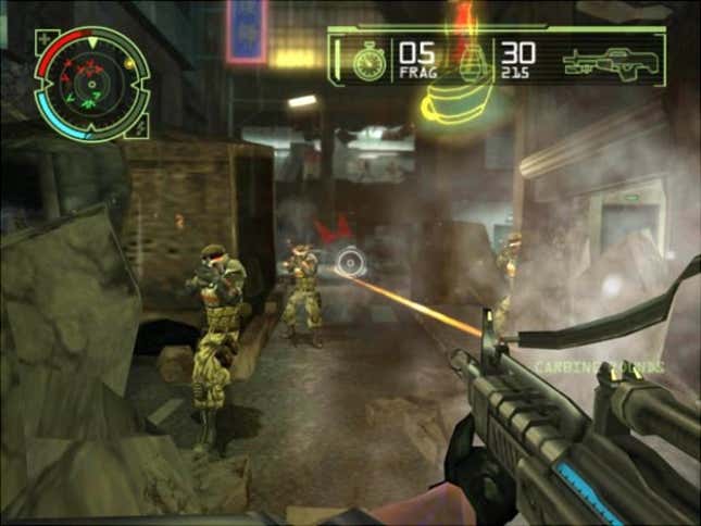
And even a less obscure PS2 game, the original God of War, had a giant sword for its health meter.
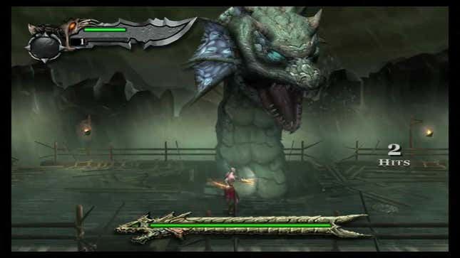
Compared that last screen to this screenshot from the newest entry in the God of War series, confusingly named God of War, released on PS4 back in 2018.
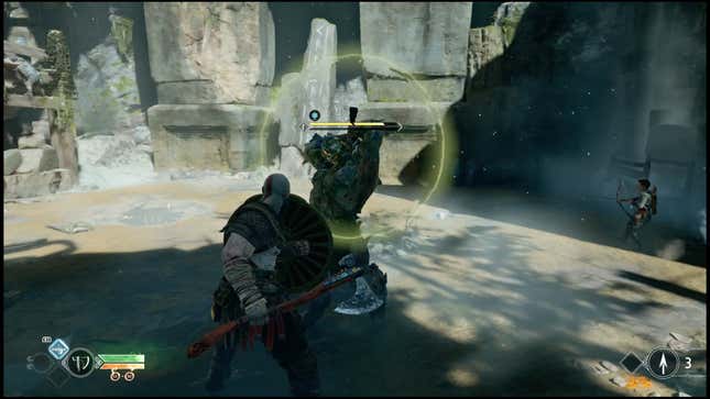
Again, like Odyssey, it works great. But it also has almost no personality. It’s boring. And yet, for the most part, this is what all video game HUDs have become. Clean, slightly transparent boxes and white lines that often fade away when not needed. I understand, and even agree, that these new HUDS are more effective at translating information and data to players. But there has to be a middle ground?
An example of a game that has HUD graphics that aren’t boring, but not too weird or big is last year’s Devil May Cry 5.
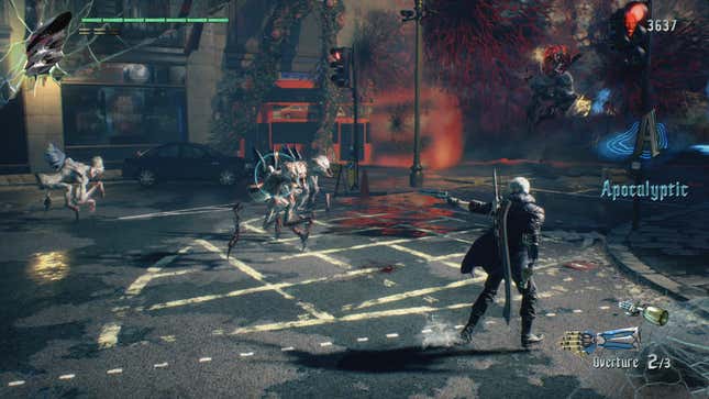
The text is sharp and clean and the icons are small, but there’s also a variety of colors, a weird devil face, and some broken glass on the corners. It has style. It doesn’t look like a console from a JJ Abrams Star Trek film. It looks exciting but also I can clearly understand what information the game is sharing with me, which is always vital.
As TV screens get bigger and resolutions go up, folks want to see more of their gorgeous games. They don’t want big skulls or stars covering up the action. I get it. But so many games having the same looking HUDs feels like a step backwards after having years and years of wild and cool menus and life bars. I understand a lot of work goes into making these clean and sharp menus and HUDs, but the end-user just sees a simple box and some white text.
I’d love a feature to turn on more complex and weird HUD artwork and designs in games next generation. Let players choose if they want something clean and efficient or big and dumb.
I know which one I would choose.


