
What do two overlapping rectangles and three parallel lines mean to you? They're the labels on a pair of buttons on the Xbox One controller, but eight months since that console's launch, you'd be forgiven if you failed to predict what pressing them actually does.
The left one is the View button. The right one is called Menu. If you're unsure what exactly they do, I hope it gives you comfort to know that game developers and apparently even Microsoft are at least a little mixed up about what they're supposed to do, too.
I've been testing the two buttons on a variety of Xbox One games lately. I've been pressing them when I'm on the Xbox One dashboard, convinced there's a method to their apparent madness.
Today, I reveal the results to you. Plus, I've got an idea for Microsoft about how to make their buttons make more sense.
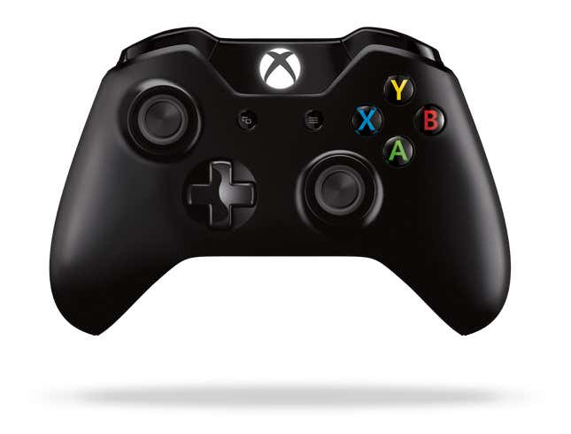
But first.... first, I am going to share the best information I've managed to obtain about one of these buttons. That'd be Menu (the one on the right!).
"I think you should think about the right button as the right click [on a mouse] if you're a PC guy," Phil Spencer, the man in charge of the entire Xbox division at Microsoft, recently told me. Phil Spencer should know! I'd warned him that I'd be investigating these buttons. He seems cool with that.
He explained the Menu button some more: "If you were in Windows and you saw something where you wanted to bring up—I'm not saying this is universally true—what actions you could take on something, you hit that one and it will usually bring up some context menu of things that act on that entity."
Xbox boss Phil Spencer: 'I think you should think about the right button as the right click [on a mouse] if you're a PC guy.'
It turns out, as you'll see below, that thinking of Menu as "right mouse click" for the Xbox One controller clears just about all of that button's confusion up.
The View button? Not so much. Spencer again, speaking about View: "[It] is more of a navigation between the different windows. I'm not saying the buttons are infinitely articulate, but that is the frame I have in my head when I use it."
It sounds cool. The intent is good. But this story that you're reading, obvious fishing attempt for a Pulitzer that is, is about execution.
Let's do a quick history lesson.
This is the Nintendo Entertainment System controller from 1985. It's a classic. It has two buttons in the middle: Select and Start.
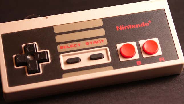
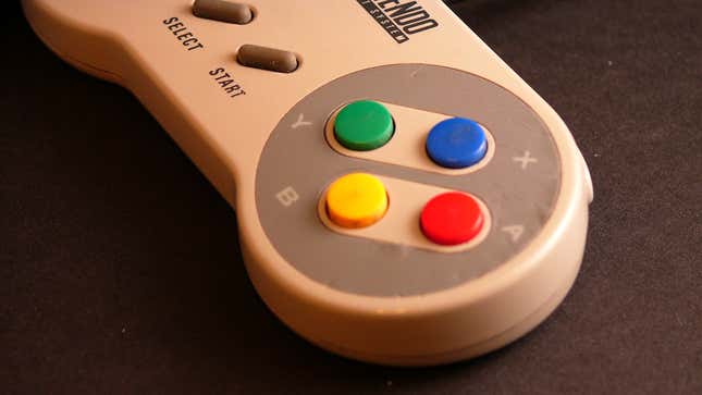
Super Nintendo from 1991? Same thing:
The first mid-90s PlayStation controller? Ditto.
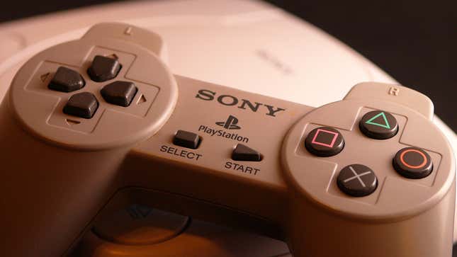
Skipping ahead... the 2006 PS3:
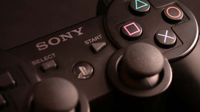
Select.
Start.
These buttons have been commonplace for generations, but it's also been clear for a while that their usefulness is expiring.
In the old days, the Start button might have propelled you from a menu into the action of the PlayStation game you were playing, but the X button might have done that, too. The Start button had been pausing games for years, but newer Home buttons now often do that, too. And Select? It hasn't had a clear purpose for a long time. Because of this, we've seen some tinkering.
This is the original controller for the first Xbox circa 2001. Select is gone, replaced with "back."
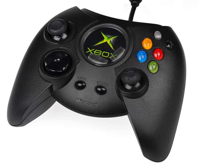
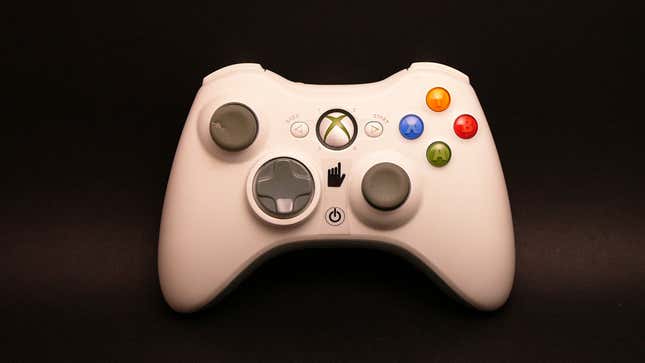
Here's the Xbox 360 controller from 2005:
Here's the Wii Remote from 2006:
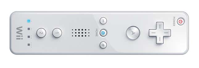
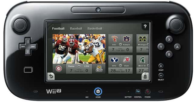
Nintendo hasn't backed off the Start and Select concept altogether, as you can see from last year's Wii U GamePad. Their reclassification of the Start and Select buttons as + and - is a hint that they don't think the old paradigm is perfect either...
Finally, here's 2013's PlayStation 4 controller, which, like the Xbox One controller, has chucked Start and Select altogether:
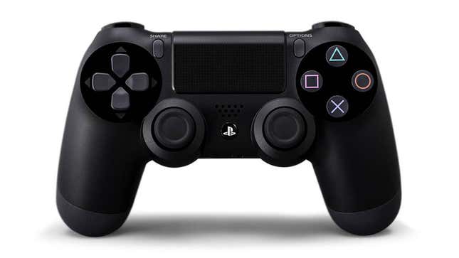
Share and Options, see? Why not? You use the Share button to capture and share screenshots and videos (in theory... but using it can be a bit confusing). You get lists of options with the Options button as if it was, you know, a right mouse click.
History lesson over.
Shall we dive in to how the Xbox One's versions of Start and Select—Menu and View—actually work? We're going to begin with how these buttons work in a variety of Xbox One games.
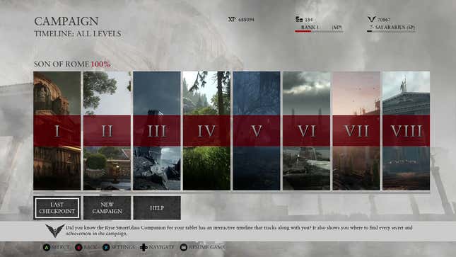
Ryse: Son of Rome was a launch game for the Xbox One. I liked it. If you go to Ryse's menus and press View or Menu, nothing happens.
If you go into the action...
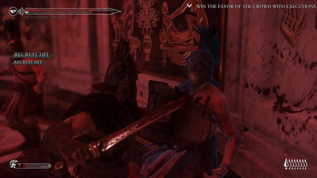
... pressing View gets you this:
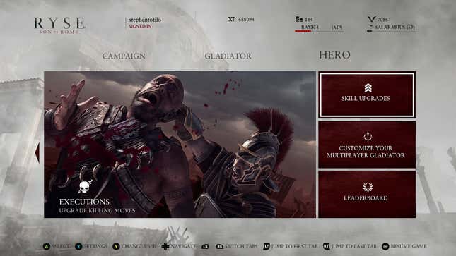
...pressing Menu get you this:
That sort of makes sense, maybe?
The View button is showing you windows of move upgrades. The Menu button is showing you a level-select screen. Strangely, you have to press Menu to exit either of them. You can't exit the View button by pressing View. Logical? Confusing? As you'll see, we can at least say, "Hey, it uses both buttons!" This is not true for all Xbox One games.
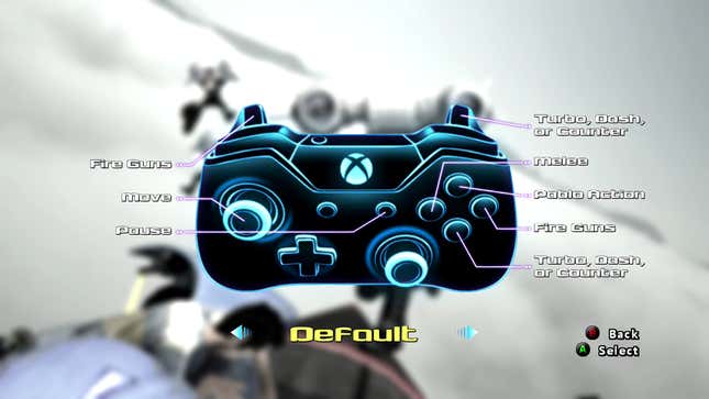
In the Xbox One launch game Lococycle, the View button doesn't do anything. Menu pauses the game and brings up menus:
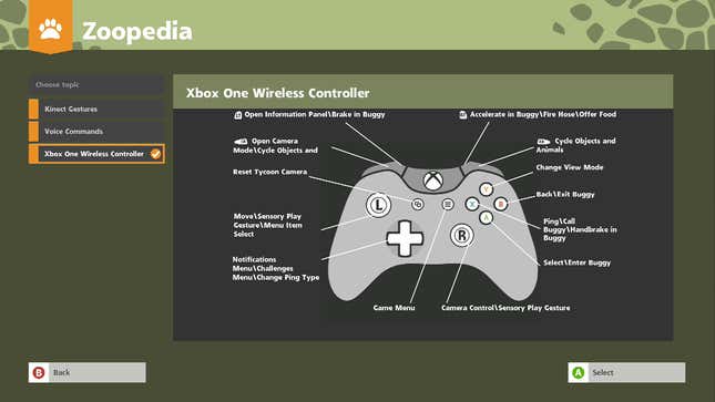
In Zoo Tycoon, another Xbox One launch game, the View button doesn't do anything until you've pressed Y to get into that game's overhead tycoon view. In that view, pressing View snaps the camera to the entrance of your zoo. Wait for it...
The Menu button pauses the game:
In another Xbox One launch game, Killer Instinct, the View button is used to taunt opponents. Menu pauses the game. This can be changed, though. You could map View to medium kick or heavy punch, if you'd like:
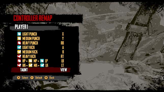
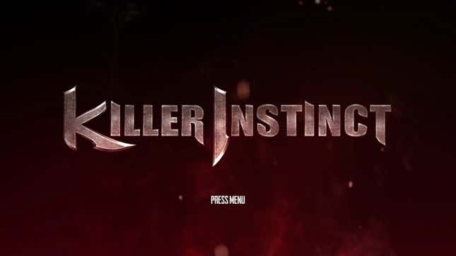
You might (emphasis on might) find it interesting that Killer Instinct is one of the Xbox One games that actually asks you to press the Menu button to get the whole game started. In this game, the A button won't do that.
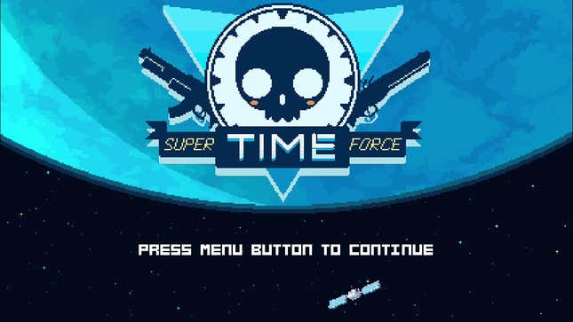
Indie game Super Time Force also beckons you to press the Menu button (though A will work in this case)...
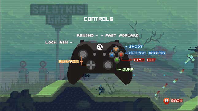
Super Time Force game doesn't officially have any role for the View button, but if you press it while playing the game, you'll see that it clones the function of the B button, triggering the game's signature Time Out mode.
Xbox One launch game Forza 5 is a weird one. The Menu button doesn't do anything when you boot the game up, but View, for some reason, will back you out from the game's main menus to the game's very first start screen.
So pressing View will take you back, from this...
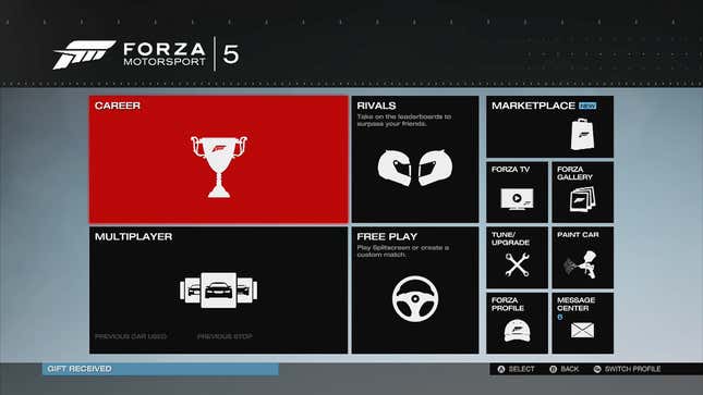
...to this...
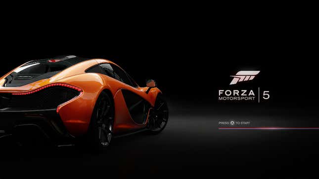
Why? No one knows! Well, at least I don't.
Note that Forza is still a "press A to start" game. To hell with that Menu button.
Once you get racing in Forza, the Menu button pauses the game and brings up menus. The View button cycles through in-game camera angles, from behind the car to a cockpit view.
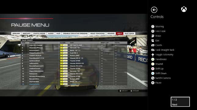
The Forza people might be onto something.
Maybe the View button should be used in games to change the view! I guess the Powerstar Golf people would agree. In that game, Menu pauses things and View switches views as you can see here:
How about Titanfall?
In multiplayer, pressing View gets you this:
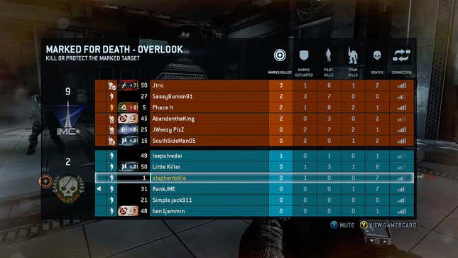
Menu gets you this:
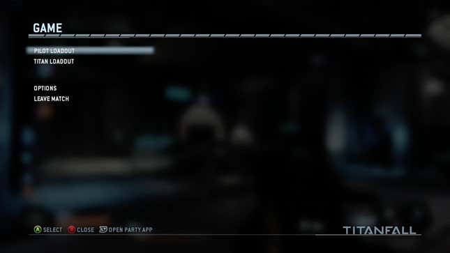
Dead Rising 3?
View gets you tutorials [UPDATE: A reader tells me this is only in the early part of the game and that View eventually triggers a display of your inventory, the map and upgrades]:
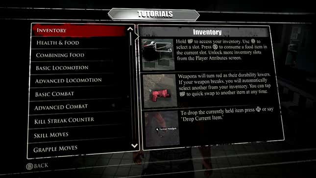
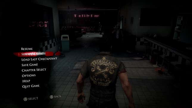
Menu gets you:
One more game! This is a good one. Crimson Dragon, a game that uses the Kinect sensor a little bit. Now don't look for the in-game control guide to tell you what the View and Menu buttons do. Useless, see?
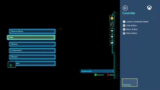
If the game won't tell you, I will: In Crimson Dragon, Menu will pause the game and produce menus like you see above. View is altogether more awesome. Whether you're in the menus or actually playing the game, it will toggle the appearance or disappearance of a small blue-framed box in the lower left corner. That box shows you what the Xbox One's Kinect sensor can see of you! This is handy, given that the game, which involves flying dragons, uses the Kinect to detect whether you're leaning to the left or right. Leaning really far either way triggers a barrel roll.
Smart idea, Crimson Dragon people! Too many Kinect games leave me confused as to whether my gestures were detected by the sensor. This makes things more clear.
Let's talk about Netflix next. I know it's not a game, but you might think that all that Menu-as-pause-button stuff would apply to Netflix.
Nope! If you press Menu while you're mid-show, you get a dropdown menu, but the show you're watching doesn't pause.
At least the Menu button does something in Netflix. Pressing View while you're using the Netflix app does nothing. Oh well.
While most of the games I mentioned above were published by Microsoft, maybe we shouldn't expect the View and Menu buttons to have any consistent functionality in Xbox One games. After all, the X, Y, A and B buttons do different things. The triggers do different things. It's nice that Menu usually pauses these games, but why can't View be used to change the camera view in a racing game and to taunt an opponent in a fighting game? To answer my own question, it can do that, but it might as well be called the Z button if it's going to have that kind of algebraic versatility.
Let's look at the Xbox One system itself, though, and see what the View and Menu buttons do there. It's at this level where Spencer's right-mouse-click concept is most applicable.
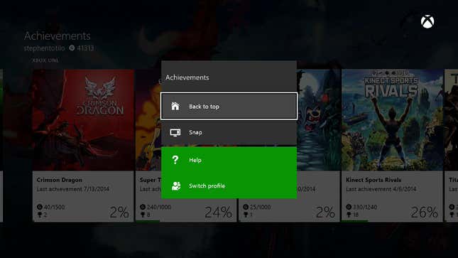
If you're on the system's Achievement app, and press Menu, you get this dropdown:
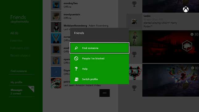
Press Menu when you're on the Friends app and you get this:
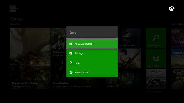
Press Menu when you're in the online store and you get this:
All good!
Less good and somewhat more perplexing: pressing the View button in all of those above situations does nothing. It's like one of those keys on your keyboard that you never use.
If only it was all this simple: Menu button used on the Xbox One dashboard; View button neglected. It's not.
Now bear with me, because this is going to be a bit confusing...
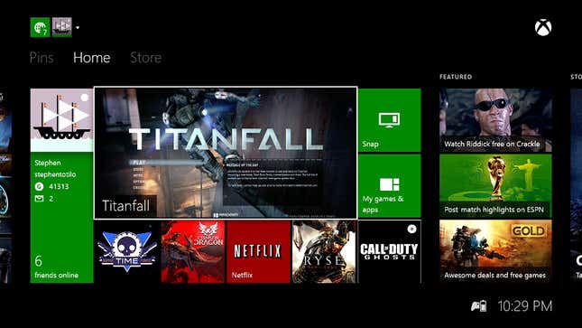
On the main home screen of the Xbox One dashboard, you will see one large pane—the hero window—and four boxes below it. The hero window shows you the game or app that you're currently running. The squares below show you the previous four that you had running. If you select any of these with your controller and then press Menu, you'll get a dropdown menu like this:
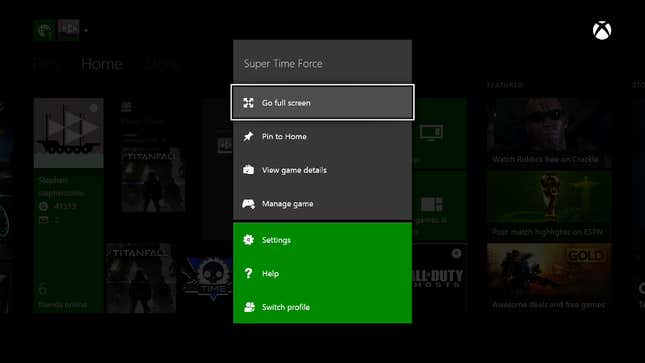
If you highlight the big hero pane and select View, you'll get a "Manage" view...
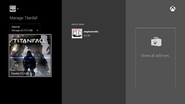
The Manage view is used to uninstall your game and maybe manage your save files, I think. You can also see add-ons—at least some of the time. The Manage view appears differently if you're selecting a game when it's in one of the four squares below the hero pane.
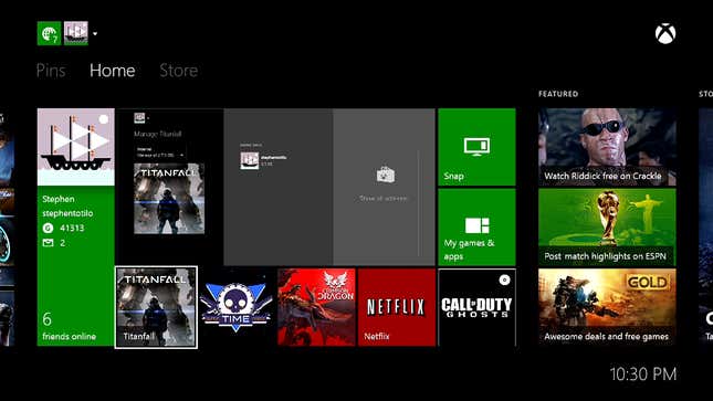
This is what it looks like if you've highlighted one of the four lower squares and press View:
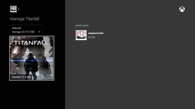
We're in the Manage view, but where did the Show All Add-Ons thing go?
The strangest thing about the Manage view is that, even though you enter it by pressing View, you can't exit it by pressing View. If you're in Manage view and press View again, you go to the Xbox One's game store.
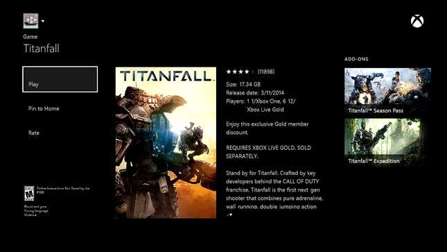
Pressing View when you're on the store does nothing. You'd best hit the controller's Xbox Home button to get back to where you started.
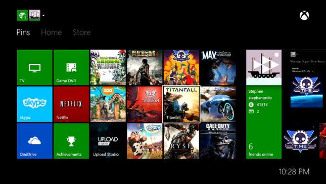
One last thing about this. From an Xbox One user's perspective, the hero pane and the four squares below it are no different than the square "pin" icons that can be assembled to the left of the main dashboard screen. Those pins serve as shortcuts for quickly loading the game or app they represent. But there is a difference. Pressing View on your pins does nothing.
What to make of all this?
After all this poking around, I'm feeling good about the Xbox One's Menu button. It's mostly being used for consistent purposes on the dashboard and in the system's games. It produces dropdown menus on the dashboard; it pauses games.
The View button, however, is a debacle. It's not being used consistently, and it's not really being used well anywhere other than in Crimson Dragon. It's a rebelliously-labeled button that has no good cause. Happily, I have a cause for it: Snapping.
One of the big, distinct features of the Xbox One is that it can run and display two applications on your TV at once.That's Snapping. It's the thing that the PS4 and the Wii U can't do! You can be watching TV or playing a game on the main part of your TV screen and "snap" an application into a bookmark-shaped strip on the right. Currently, the best way to start snapping an application is to use a) the verbal command "Xbox, snap..." or b) to double-tap the Xbox One controller's circular home/Xbox button.
If Snapping is a signature Xbox move, why would you have to double-tap a button to activate it? I mean, imagine if there was a dedicated Snap button. It might look strange to label that button with the word "snap" and, hey, it's too late for that anyway. The controllers are already in people's hands. But this View Snap button that we're talking about already bears the iconography of two rectangles interacting with each other—snapping together, if you use your imagination.
I dare say that the View button is begging to be re-worked as a Snap button. Put that in an upcoming firmware update, Microsoft?
It's certainly not too late for Microsoft to get its Xbox One buttons working in a useful, predictable way. They could do what I'm suggesting and re-brand the View button. They could leave it be and simply use it better—and help developers figure out what to use it for, too. It's their call, naturally.
I'm at peace with the idea that the video game controller Select button is nearly dead. I'd now like to see the Xbox One's replacement start to make more sense.
To contact the author of this post, write to stephentotilo@kotaku.com or find him on Twitter @stephentotilo. Top image by Jim Cooke.

